Although every care has been taken to remove mistakes and insert the correct information, mistakes and mix ups do occur. If you find one of these mistakes, please forgive me.
At times, I found the experience of learning, documenting and transferring information to the blog very complex. And as I am only human I did get mixed up and made mistakes.
The website links, images, tasks and information were what I studied at the time of writing the blog.
Websites and learning resources are constantly improving and updating so I wish to let you know that they may have changed over time. What I studied and the links and images I have included may no longer be available.
I hope you find the blog entries useful.
Had two missions in my head and I didn't know which to start first.
While at work I was thinking of what to do today when I hit the code.
The two options were: Research regarding adding a comment's box to the blog or research regarding adding e-commerce to my wife’s website?
Decisions, decisions, decisions.
The comment’s box won. I spent most of today’s free time reading and researching the easiest and the best technology to use to build a comment box.
It may look as though I am getting ahead of myself or running before I can walk, but there’s no harm in making an early start on understanding a subject before I reach it and things gets serious.
It took a while but I found A few ways of achieving the comment’s box. Unfortunately, the easier ones wouldn't allow the comments to be saved which seems like there wouldn’t be any point in doing it at all.
Once I started typing it out, I felt such an inexperienced newbie as it was a whole new language I was messing around with and a language that I had no experience with.
I carried on and set up an index.php file and typed. This is the first section using only HTML:
My eyes were getting heavy and my typing had slowed to a crawl by now. I cheated by copying and pasting the final few sections, just to see if it worked. It did.
It wasn’t until I typed out the blog entry that I noticed the old, old date on the website. I wonder if it is still okay or whether there are any undated/newer versions?
After reading about APIs, I decided it was way over my head and it would be better for me to focus on some e-commerce for my wife’s site. At this moment in time, I'm not sure whether the e-commerce will be any easier.
I asked my wife how long before she wants it up and running and she replied - "ASAP". I will leave it for later when I will have some quiet time to read and see what is the best method and technology to suit her requirements
I like the gradient colour so I used it on my blog. I thought it was a bit intensive so I calmed the colours down by using a fainter shade. The only issue now, is that the borders of the boxes clash a bit.
The table of contents only lead to the payment page and I stopped there. I then switched to old faithful - W3Schools. I started on the JS tutorial.
I enjoyed getting back to studying.
I then moved on to my wife's website. I had hoped to crack on and add some more pages to the site and connect the existing pages with working links, but it didn’t go to plan.
While opening up her website’s file the other day, I accidentally deleted the contents. It wasn’t a major issue as I had saved a copy of the code, but it did shock me a little. All I had to do was copy and paste the code back into the VS Code. It wasn’t one hundred percent okay because I needed to update the path for the images and make a few adjustments here and there.
I am not 100% sure, but I thought I remember the accidentally deleted website being responsive but this copy wasn’t. I spent the rest of my time struggling to make it responsive.
I couldn’t do it. I don’t know why I couldn’t do it. I looked at some old code that usually works. I went on W3Schools.and I still couldn’t do it. I realised that I had copied and pasted two of the CSS code and I needed to remove one and go from there.
That didn’t work and I still couldn't make it responsive. It really made me think whether I will ever get the hang of this. Maybe, this is my wall? I have hit a few along the way but waiting until the following day, has shown me that everything is okay as it comes together and it also shows me that I am capable of doing this stuff.
Being away from the websites for a few days has made me feel like I have forgotten a bit and I’m slightly out of practice.
I called it quits in the hope that tomorrow will be better and bring me some good fortune.
Last night I was reading about web hosting and trying to forget the trouble I had yesterday. Today, I was on a mission and I started from scratch and built a new website using saved code from previous projects and some awesome tips and ideas from some fantastic developers.
Again, I take my hat off to these guys. I really think they know their stuff and make it look easy. Anyway, I struggled and got lost at a few points along the way and with a few simple tasks.
It’s amazing how quickly I’ve forgotten some stuff after just being away from things for a while. And when I say a while, I mean, I had forgotten simple stuff that I had used only a week or two ago on the blog site.
It was a pleasure looking up stuff and researching how to do this and that. I have also heard that this is an important part of the game. I finally managed to get the website homepage finished and then moved on to all the other pages.
Presently, my wife has about 20 items to sell which I need to build 20 separate pages along with the home, about and contact pages. I need to add e-commerce which will add more complexity.
This is going to push me to my limit. I envisaged a simple landing page, perhaps a brochure website with a few pages, that I could build in no time. How wrong was I.
I am up for the challenge and I am looking forward to it. This will teach me alot. I have some practice with the blog and linking the pages but this jumping up a league in not just skill level, but also being exposed to new techniques and many new things that I haven’t done before such as product layout, buttons and everything else.
I have made a start and the image is on the page, but not in the correct position Unfortunately, it is still a bit lower down the page than I have wanted but I have managed to put the description to the side like my wife has asked.
I have been googling all the issues and problems as I encounter them and I seem to be making progress.
So overall - a good day.
I focused on two things today with the hope of completing at least one of those missions.
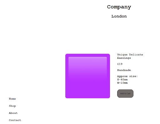
After that, I spent my time trying to get one of the item’s pages right. This is the website layout I am trying to clone, with the sidebar on the left, images in the content area and the description and add to cart button on the right:
If I get this page right, then I can use it as a template for all the other product pages. Man, I am realising that it is way more advanced than the skills I presently possess, but no harm in that.
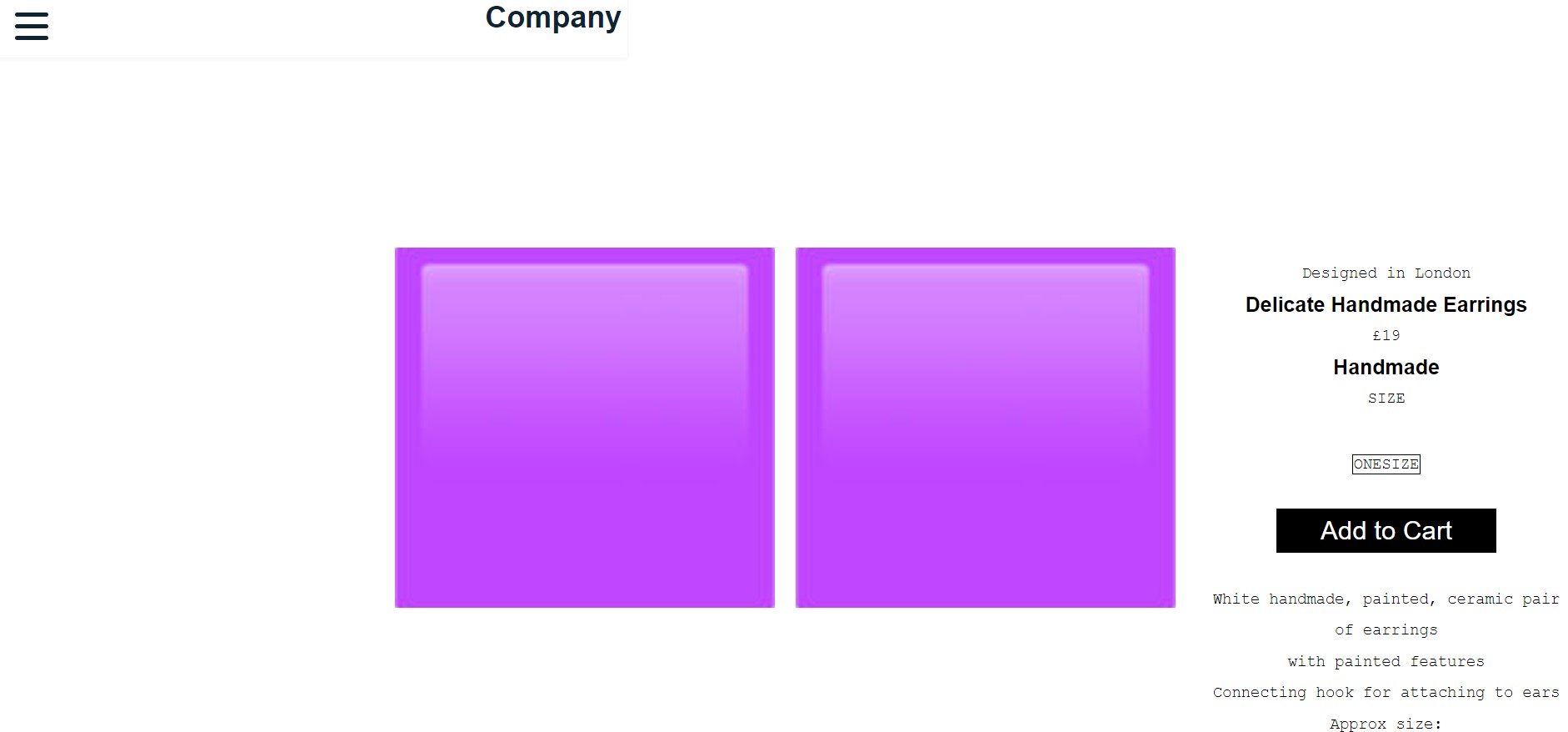
I then went round in circles for the rest of the time I had today. I just could not get the image to the position where I wanted it. One positive was that I could get the description and button correctly placed next to the image.
The only problem with that was that the image and description were correct together but they were not in the correct position on the page:
As you can see, they encroach into the sidenav territory and are too low down that they now invade the footer.
I googled this issue and followed the advice of five websites which included positions of: center, align, margin:auto and order-1 but nothing was perfect.
The image moved but also the description moved elsewhere. It was so frustrating. I decided to then try highlighting the sections to make them visible and see if there are any issue and this is what I got:
The header is full width but the sidebar is not full height, so I guess that's why the image moved into its territory.
At this point, I called it a day and decided to take a break. Later that evening I read a little bit about the possible issues and I also turned to Youtube for help.
I didn’t seem to accomplish much today apart from going around in circles. In the process of going around in circles, I know that it isn’t wasted time, and it is necessary to get to your destination and I am learning.
I scrapped yesterday’s code and started again with some old code. I highlighted the sections again, so I could see them and I went from there.
It sounds easy, but all I have to do is place the image in the content section and position the text to the right of the image. Below are various stages of not accomplishing my goal:
I even changed the order in which the code was written. I looked at some previous card code and I had the img code at the bottom and before the description. It was worth trying as I got this:
I started working from here. The next image below is where I am up to. I know that I am missing a trick somewhere. And I know there is an easy option. I am googling the answer and trying everything I read but it isn’t working.
I have centred the image but I can not get the text positioned to the right of the purple box:
I managed to centre the purple square and position the text to the right in the end, even though the text was slightly higher than the square. The only problem I had with that version was that it put a scroll on the bottom and was not centred in full screen.
I did learn a lot today and I’m almost there - I can feel it. I just cannot find the right combination to do it right. I tried so many different ways from advice from so many websites and developers, but I still couldn’t do it.
Later on, I watched and read some advice on cards. Tomorrow, I will try making a card and positioning the text with the image within a border and positioning it in the content area. I will then remove the border so it appears invisible to the white background.
I ended the day earlier than planned after admitting defeat. But, that was not the end. I couldn’t resist having one last try at my idea of trying the card thing and this is how it went:
I struggled for over two hours today and an hour and a half yesterday and then this idea of the card took me 15 minutes to do. I looked back at some older code that I had saved and then set about trying to implement it myself from my memory before reverting to some research.
I know the card thing is not that completed and it’s still work in progress but I had the idea and sifted through Youtube in search of cards and his vid had the image and text in exactly the position I wanted. I watched it a few times and thought that I need to try before I go to sleep.
Thanks Dev man
Day total: 2. Hours 42 minutes
Monday 7th March 2022 * /
Felt good today as I repeated some familiar tasks
I’m happy with the card idea from last night. Please contact me regarding other ways of doing the same thing, so I and others can learn from my mistakes.
I started the session with a page of JavaScript. Today’s page was about JavaScript statements which included:
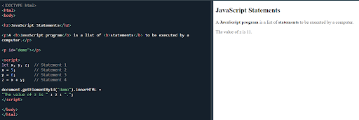
JavaScript statement
And:
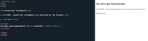
JavaScript statement
Semicolons:
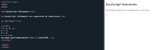
JavaScript statement separated by semicolons
Multiple statements on one line:
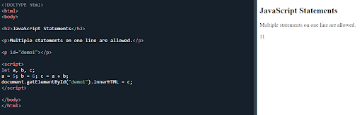
JavaScript multiple statements
Next it was back to the task of my wife’s website. I started copying the semi-successful necklace page to all the other products and all I had to do was change the description.
Next it was on to linking all the pages up together. Second time doing this as I have had previous practice with the blog.
And finally, I started the ‘about’ page by adding a picture and a few paragraphs of text. I used a border to surround the image and text and I did ready the ‘clearfix hack’ but I had no issues when I reduced the sizing of the screen.
I checked on the inspection tool and the different phone screens tool to see if it looked ok, and it did. I can’t believe it.
I know I am getting somewhere as I am beginning to repeat and perform tasks that I have had to do before. This is a good sign and shows that I am gaining experience and I am happy about it.
I haven’t made a full website with multiple pages and made it go live yet but this project is large and my wife is asking alot of me.
Day total: 2 hours 27 minutes
Tuesday 8th March 2022 * /
Absolutely buzzing today - until I hit the text-blocks
Last night I opened a Github account because I am worried about losing my code and want to back it up.
I read a few stories of people, who, like me are at the beginning of their developer careers all having saved code which they store just in case it is needed for other projects in the future. They, like me are storing it in many places. I’ve heard of some real horror stories of deleted code and cats walking across keyboards and accidentally deleting code.
I had a scare the other day and I’m currently storing different snippets of code in different places, ready to use at another time. I am copying and pasting mine to documents on my Google account as well as on a memory stick.
As I opened up the Github account, and the site asked me what type of person am I? I clicked the box that said ‘hobby developer’, which I am happy to call myself and I now have a title.
I briefly looked at whether I it was possible to save my code on VS Code, but I decided to go with Github. I accidentally deleted another page yesterday but it was not a major incident.
No JavaScript studies today. Instead, I dived straight into my wife’s website. I am devoting all my time to it at the moment as there’s so much to do and learn.
Today was doing some fiddly bits, when I remembered that last night, the homepage wasn’t the home page after all. It was more of the shop/product/index page.
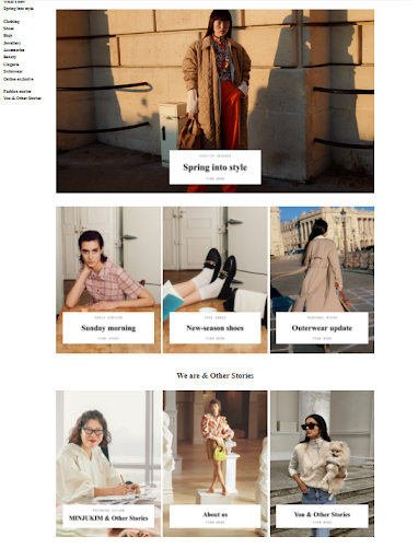
This is the homepage of the Other Stories website:
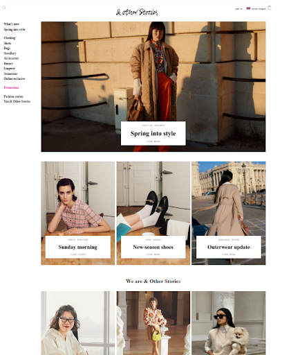
Other Stories website homepage
Grid again. I looked up an old project where I had used it before as a small reminder to myself of how it works again, and then I got to work.
I changed my code class names to simplify them, I also removed any unneeded and unnecessary ones which were there that didn’t do anything.
I’m trying to keep it simple by reusing the same grid-item item1 format that I have used on the homepage of the blog site. It works and I understand it so no point in changing it.
I sifted through her Instagram account in search of some images I could use for the shop/home/index page and got on with the job.
It was awesome to encounter the grid again. Reunited with an old friend. A friend now because I understand it a bit more. When I was trying to get to grips with grid, it felt more like an adversary rather than anything remotely friendly.
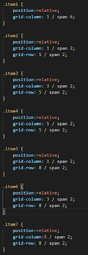
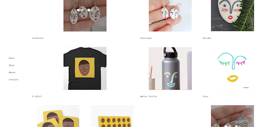
I am by no means an expert but I can arrange the images over the correct span of the grid-column and grid-row with minimal fuss now. This is what I came up with:
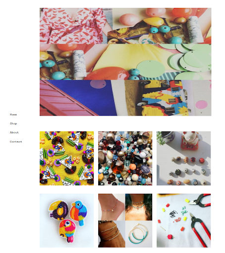
My version of the Other Stories homepage
It looks amazing on the browser and I can’t believe I managed to do it. Next job was to add the blocks inside the images that contain the text. I went directly to W3Schools to learn how to add text-blocks over image.
By this time I was having a lot of fun and really enjoying myself. I can’t believe how much I love doing this stuff. Learning to add things and new trick is awesome man. I feel alive and I’ve found something I really enjoy. I feel lucky.
W3Schools showed me the way:
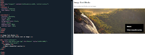
Image text blocks code and example
Looks pretty straight forward. I’ve saved and used a total of seven images, so I need seven text-blocks of different numbers.
I’ve stuck with the values in px to begin with and I can always change them later. Firstly, I wanted to see where the block positions itself on the image before I make any adjustments to its size or position.
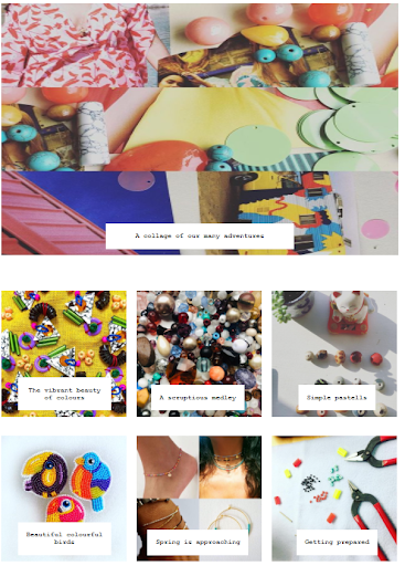
I used a white background and black for the text and this is what happened:
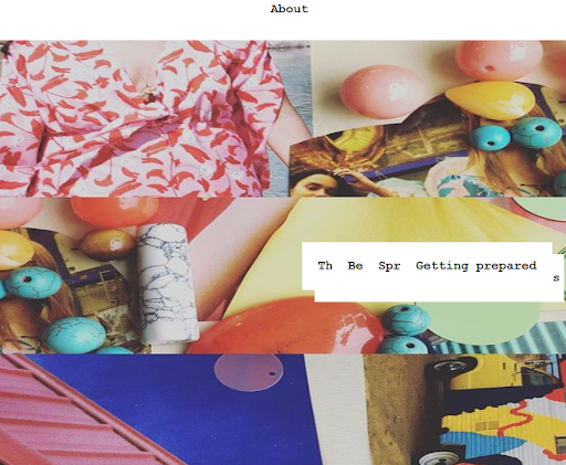
The homepage with text-block
As you can see, multiple blocks appeared in the same image. I then moved the images out of position and place the blocks here:
Text-blocks repositioned
I will leave it at this for today. Very happy with my progress and I’m looking forward to solving the text-block issue tomorrow.
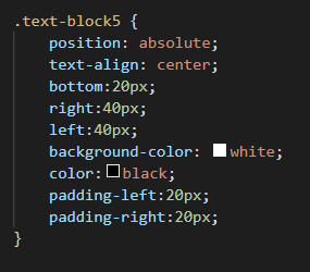
I already have a rough idea of what could be wrong. From this code snippet, it states the ‘position:absolute’ position, so I am guessing it is positioning the text-block on the page rather than the image.
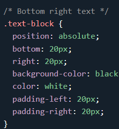
Code snippet using position:absolute
Only time will tell and I hope to find out tomorrow in the big reveal.
Day total: 1 hour 49 minutes
Wednesday 9th March 2022 * /
Accomplish one thing today and tried some changes which I didn’t finish
I started with some JavaScript as a warm up and to help me to keep move forward and learn some new stuff outside of the website which I am focusing on so much.
The page I worked on was JavaScript syntax on the W3Schools website.
Firstly, it was the ‘values’ and ‘laterals’:
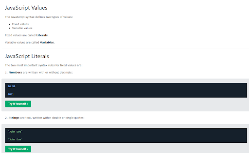
JavaScript laterials and variables task
Next were the 'variables' and 'operators':
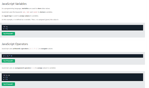
JavaScript variables and operators
Then ‘expressions’:
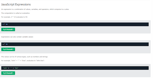
JavaScript expressions
‘Keywords’:
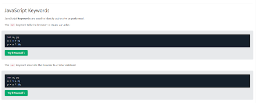
JavaScript keywords
‘Comments’ and ‘names’:
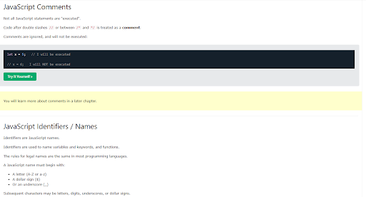
JavaScript Comments and Names
‘Case sensitive’ and ‘camel case’:
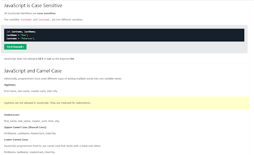
JavaScript case sensitive and camel case
With the JavaScript, I’m practising it but not in the same intensive repeating fashion I did for HTML and CSS. I am practising it to get some experience and to get familiar with it in a gentle manner. I’m also not covering all of the topics as I did with CSS as I know that the chances of using all it is small.
I went heavy on the HTML and CSS because I was (and still am) a newbie and that was the only way to get some experience under my belt in a short space of time. Presently, I don’t have as much time and energy so I’m not going too intense on it.
Next it was on to ‘project website’. I managed to add the text-block and I was wrong with my guess last night regarding the positioning. Then it was a case of adding the code to each individually. Here’s the code snippets:

HTML text-block code snippet
CSS code snippet for the grid-item
CSS for the text-block
I began playing around with the px numbers to get an idea of what the padding, bottom, right and left properties did. I then adjusted the size of the text-blocks to suit each image and text, ending with aligning the text in the centre.
It took a bit of fiddling and changing the figures to understand what was happening but I completed it. This is how it turned out:
Images with text-block
I am so chuffed with it. Man, the colours look awesome and my wife loves it. And the image below, is what I am trying to replicate:
The Other Storries homepage
Plenty more work to be done but happy so far. Now, I turned my attention to the 'shop' page as it wasn’t looking too hot. The images on the 'shop' page were smaller and I was using a different code to the homepage.
I felt that the homepage was a lot simpler even though I used used grid on both pages. On the shop page, I was using ‘grid-template-columns:repeat’ and ‘grid-template-row: minmax’:
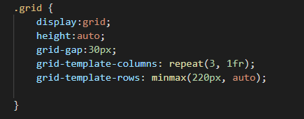
My CSS grid code for the shop page
Whereas, with the homepage, I was using the ‘grid-column’ and ‘grid-row’ with ‘span’:
My CSS code for the homepage
Which seems cleaner to me. They also have slightly different div classes because they have both evolved in different ways. I took to the 'shop' page to simplify it and use the column and row-span properties.
And that is as far I got today and this is how I left it:
The messy shop page so far
I will tidy it up tomorrow and see how it works. I currently have all the pages saved with a .html ending and I have another file named sampleindex.html and another named sample.css and jsindex.html. These files are a place where I can practise new code while leaving the real files alone. It’s a safety measure to mitigate any mess ups, such as when things go wrong and I lose the code when I'm experimenting. If the experimental code works, then I transfer it over to the website file. If it doesn’t, then I leave it alone.
As I now have Github account, I will make the most of it and upload the site at some point. I think another bonus is that Github allows users to revert back to earlier forms of saved code. I’m not 100% sure about this. I am also not 100% sure about uploading the code for any website which can be viewed or adapted by anyone.
Day total: 1 hour 47 minutes
Thursday 10th March 2022 * /
Spreading myself too thinly and and getting nowhere
I didn’t want to but I started with a page of JavaScript ‘comments’.
JavaScript uses the slash which is not too dissimilar from HTML, CSS:
Comments in JavaScript
More comment related stuff
JavaScript comments
Again, I didn't go heavy and do the full repeat, repeat repeat as I have done in the past. My new approach that is more gentle by using a little exposure often to get familiar.
Next, I opened up my wife’s website to finish the ‘shop’ page. Yesterday, I started changing it from grid-template-columns:repeat; and grid-template-row: minmax;.
I completed my mission and simplified the code by removing some unnecessary classes and CSS and by updating the the CSS with some newer and more slick code.
It didn’t make aligning the text easier. I still couldn’t get the text to centre under the image. I called it quits at that point. I needed a break from the code and thought that some distance would hopefully be good for me and the site.
Instead, I turned my attention to my blog.
My last visit to the blog saw me add some gradient colours which I really like. The only issue is the gradient colours clash badly with the border colours on the boxes.
When I mean clash, I mean too vibrant and garish for the page and my eye. I felt as though they were being burned by the vividness.
In order to keep the gradient colours, a compromise is needed. That compromise is to alter the colours of the borders. I changed them to black in keeping with all the other black themes on the page.
I signed up to Font Awesome to get some social media icons. I’m not sure how it works but I quickly got told to upgrade in order to use more icons and that upgrade costs.
There’s another site I have heard of but I could remember what it was called. As I was searching, I realised there were plenty of sites that supply icons, but at present, I’m not sure which ones are free and which ones cost, so an investigation looks on the cards.
The ‘about' page is a soft gentle slight light turquoise which is nice. From here on, I did nothing else to it visually or coding wise. Instead I rewrote some of the ‘about’ page’s text.
Tonight’s bedtime read will be in search of some more knowledge regarding hosting sites and the all important prices.
Day total: 0 hours 49 minutes
Friday 11 March 2022 * /
Lost my motivation and momentum and then I found it
At work I was so pumped and buzzing because I think I have found the web host I want to use.
Last night I watched Kevin Powell on Youtube talk about free hosting using Netlify.
So before I went to bed I read about Netlify and again this morning at 03:20 when I got up for work. It has a free hosting of up to 10MB which is the same as a Go Daddy basic plan for £1 a month and that comes with a 12 month contract attached to it.
It seems perfect for what I need to get started. I just need to find out about any contracts and any other fees and extras. The Netlify also links up to Github account, so I went and googled whether Github was safe to upload your blog or website, and after reading a few comments, I wasn’t so sure.
I have a lot more I need to learn about Github before I start using it. If it’s a security risk to upload a website (and I think they mean one that has user data and passwords), then it could create some security issues. But as I am still new to the game and possibly, some time away from really making use of Github, I could be safe for now.
At work I was dreaming and getting carried away with all the endless possibilities that are appearing on the horizon. As soon as I was home, I would finish the blog, then sign up to Netlify and upload the site and have it go live this weekend- simples.
That changed the moment I walked in the door. I felt tired and after a shower and some food, I sat in front of the laptop and procrastinated.
A while later, when I did start, I didn't get far. I managed a whole 15 minutes of JavaScript on the W3Schools website about variables
.
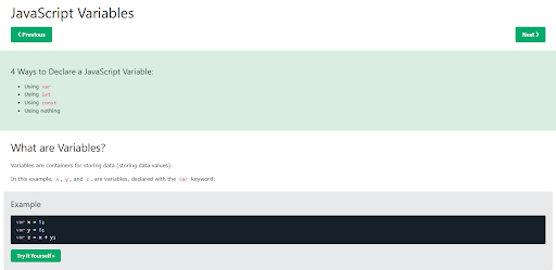
JavaScript variables
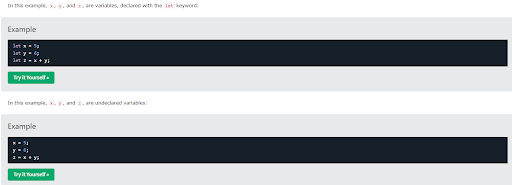
More JavaScript variables
And some more JavaScript
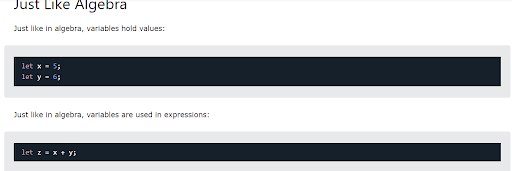
Variables hold value
And that is how far I got. I typed in the code for practise and I like seeing what it can do. Now that I have some JavaScript uses the slash which is not too dissimilar from HTML, CSS experience, I feel like I will be able to start using this and understand it a bit quicker than the JavaScript uses the slash which is not too dissimilar from HTML, CSS.
I popped off for a bit to do few things and on my return, I opened up the blog and started trying to touch up some of the unfinished rough edges. I began by softened the gradient colours as they were still making my eyes bleed.
I listened to a few episodes of Syntax and Wes and Scott were viewing people’s websites and giving them feedback. One piece of advice was to ‘eyeball it’, which means to look over it and check that some features such as font weight and colours do not clash and are clear to view. I took that advice on board and toned it down my colours a bit.
Next I rewrote some of the ‘about’ and ‘September’ entry page text, along with redoing some bits on the ‘contact’ page. To get some inspiration and to compare my site, I did a bit of search at some popular blogs and sites and I also headed to the Wix site to look at their examples.
I’m slowly getting there. I’m going to have a quick read tonight about Netlify and see if it really is the right host for me or if it is too good an offer to be true.
Day total: 1 hour 19 minutes
Saturday 12th March 2022 * /
Second day in a row that I have found it difficult to motivate myself after a long day at work
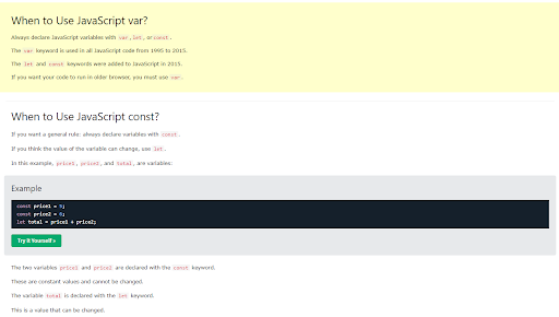
Started today as I did yesterday with some ‘Olympic gold medal level’ procrastination. I pushed through it and finished the rest of the W3Schools website about variables page:
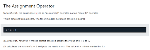
JavaScript Assignment Operator
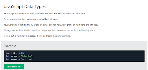
JavaScript data types
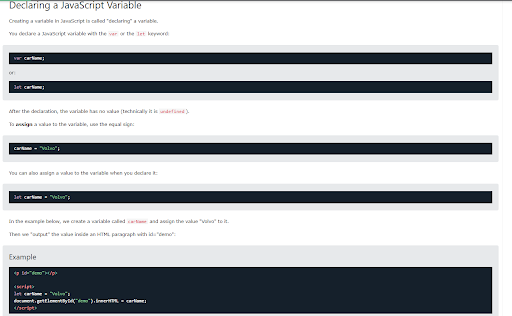
Declaring a JavaScript variable
Just a few of the tasks today. I’m getting through it and understanding a bit as I type out. Only issue I had was that the last few tasks didn’t work on my VS Code.
I left it at that and took a break.
When I returned, I made a start on the blog. I didn’t mention it but a few days ago I added a section onto the ‘September’ page. It doesn’t match up with the other text on the page, with either alignment, the font or with the margins.
I have rewritten this section a few times. I have used < ul > and < li > to present the text as bullet points but it doesn't change a thing. I have rewritten it again as a paragraph and it still remains different:
September page text
I cannot figure it out and at present, I will have to accept it and move on for now.
I moved on to the social media icons and links. Presently, I have only opened an Instagram account for the blog.
I do not know how to use the font sites to place an icon and link it to my account. I briefly watched a video about it and read a little before deciding that I will save this task for tomorrow.
Day total: 0 hours 52 minutes
Sunday 13th March 2022 * /
A roller coaster of a day with pressure and excitement in equal quantities
My only day this week to sleep in but I got up early and as I was determined to accomplish things today. To start with, I wasn’t sure if I could get the blog ready and live by the end of the day.
I started editing and tidying up the blog as I had this nice feature from the same person who designed this site:
The blog site design so far
The nice feature I added is a 6 degree tilt as you hover over the links and here’s the CSS for it:
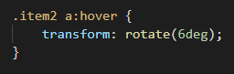
The CSS code for a 6 degree tilt
I added it to the navigation links and I tried to add it to the month links but I wasn’t able to make it work.
Next on the list was the social media icons and links. I found a site last night where they used the bootstrap icons and so I decided to go with this for now.
Type in the icon you want and it takes you here:
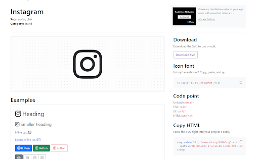
Instagram icon page on Bootstrap
I went with the ‘copy HTML’ in the bottom right hand corner and added the code to my blog page. I took a few attempts but I managed to get the link connected to my learningtocodeafterforty Instagram account. I won't not know if I have done it right until the blog is fully live and online, but, for now, it seems to work okay via my browser.
I went through the site and added it to all the pages. I rewrote the ‘contact me’ page again and added the Instagram link. I opened a Pinterest account and I seemed to get something wrong during signing up as a weird username appeared. I thought I had blown my chance at naming my account after the blog but I managed, after a few attempts, to name it after the blog.
Once I had a pinterest account, I added the Pinterest icon using the same bootstrap methods as before. I went with only two social media accounts as I read that it was best to just pick the best two social media accounts for your needs. I chose Pinterest as it was images and that was also the reason I chose to go with Instagram.
I thought I was ready now to launch the site. I knew how to drag and drop to the Netlify site after watching Kevin Powell do it. The only issue that I had now was regarding the file names for the pages. I thought all the files needed a .HTML name and so I mistakenly renamed my ‘style.css’ file.
All that appeared was the HTML on screen, so I was definitely going wrong somewhere. I did some research and I didn’t get any answers and I decided to take a break.
As I have been progressing with things, I have begun to feel the pressure at every stage. The stress is coming from my inexperience and this process is definitely a learning curve. Things were not working and going wrong, but I didn’t want to make any more mistakes by deleting anything. At this point I realised that all the links for the images and between the pages had the path links addresses which included my laptop drives and the file names.
I went back again and changed all the images and links to most straight forward base links like:
I also restored the style.css file name.
It was getting late and I was running up against problem after problem due to my lack of knowledge. I had to admit that I wasn’t ready to launch. It was very ambitious of me to believe I was ready and I was going to launch the site to the world tonight. This process is longer and more intricate than I expected.
The pressure subsided a bit, now that my deadline had been pushed back and I was more realistic. I need to learn more and this journey and all its problems is giving me invaluable experience and all this is just hurdles that I need to overcome as I edge closer and closer to the goal. There are only so many hurdles, so I just have to just keep overcoming them, until there are no more.
Another positive I can take from this, is that I am glad I am making the mistakes on my project rather than making them on a more serious or costly project such as my wife’s site or even a paid client such as a friend. This is the reason I am doing it on my stuff as a dry dummy run where I can make the mistakes and gain experience in sight of no one.
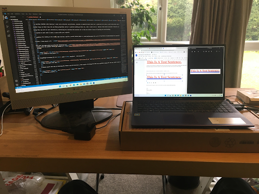
I had so many windows and tabs up on my poor laptop that I was getting confused. I now get why two large screens are useful but this is the only time in five months that I have felt that another screen would be useful. My £250 (USD $289) laptop has been awesome and I have no complaints.
The images were next on my hitlist and they needed to be added to the same folder which contains all the .html files such as the different pages. I am trying to get everything in one folder ready to upload them all at once.
Second time lucky with the drag and drop. No need to delete the previous files. It was a simple case of drag and drop the whole folder across. The first time I dragged each file individually over but this time I dragged the whole folder titled ‘blog’. And man, it worked. It looked good:

My blog folder

Blog pages folder
And the blog site files are inside the above folder:
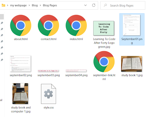
The blogsite files so far
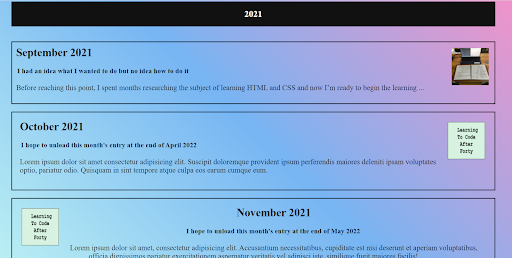
So all the files for the images and pages are together in one folder. I have only finished the 'September' page so far and I hope to complete the 'October' page at least by the end of April 2022. I’m hoping this will give me plenty of time to edit and complete it without putting myself in a position where I am rushing too much. I am juggling many things at the moment and I would like to try and keep to a regular routine of uploading at least once a month.
While I was on a roll, I decided to continue and make an attempt to add the domain to my Netlify account. This is where I came across the next hurdle. I had purchased the domain through Go Daddy and now I am using Netlify, so I had to transfer it over.
I won’t go through the process of the transfer of the domain name as I can not remember the steps and actions I took. All I will say is that it was intense and I had followed the instructions of both Netlify and Go Daddy and now I was in limbo.
I was between worlds. My domain neither appeared on the Go Daddy site or neither did the blog appear my Netlify account. I am hoping that it is just a matter of time now. A period for the exchange of things I do not understand to be moved over and verified.
I will admit that I was feeling my way in the dark and I hope that I did it correctly. I typed in the www.learningtocodeafterforty.com address on my phone and it went to the Go Daddy home page which stated that this domain may be available.
Back on the Netlify site, it stated that the verification certificates were needed, along with the DNS. I didn’t understand what this was. I entered five DNS codes and left it at that.
I took a break in the excitement and stress to write this. My neck aches and my head is throbbing slightly. I am in no man’s land. I have this feeling of adrenaline and excitement as well as feeling a bit worn out and emotionally drained.
No sooner did I stand up and have a quick walk around, did I find out the sight was live. I couldn't resist a peak on my phone.
I couldn't believe it! There, online was my five months of hard work and this was a sign that I have made progress. It wasn’t 100% perfect, it had a few faults but I was so pumped and relieved that I had learned how to design, build and I had finally made a website go live.
There are a few more details to the story of the moments after I succeeded which are on the FAGQ page in the story titled ‘The best free resources for learning web development’ and the
section where I gush about Netlify.
Man, what a moment. I have almost crossed all the hurdles I needed to cross to achieve my goal. I am still at the beginning but I have let go and pushed off from the side of the pool and now I am swimming because I possess enough of the rudimentary skills and the most basic of basic programming skills to start swimming.
I learned some time ago about the amazing feeling of setting goals and accomplishing them. This goal took me just over five months ago, I set myself a challenge and target of learning how to build a website and make it go live and I did it.
I have a new and primitive feather in my cap. I have redefined myself after forty, well, Github did that along with Netlify - I’m a hobby developer.
Job done!
Well, not quite. One benefit of getting the blog online was that it would show up any imperfections, and my, did it show a big one.
'September’s' page had one image missing and a mistake in an < a herf…> link. The blog was way too small on my phone. I have an iphone 6s and it was hard to see. I had to enlarge the screen so I could click a link:
A screensot of the blog from my phone
I immediately went to the VS Code and the file to see what went wrong with the image that was missing. It wasn’t in the folder I dragged the folder in Netlify.
I have to say that Netlify’s drag and drop is painless. I am now interested in seeing how the blog does over time so checked the cost of the analytics, which was $9 a month. I hope the Go Daddy site that I have just left doesn't offer this service more cheaply.
As I have signed up to Pinterest and Instagram, my next move was to use them to let the world know that my story is out there and ready to read:

My first uninspiring Instagram post
As the post says - I am looking forward to your honest feedback. It is now the end of November 2022 and I am in the process of editing this. The blog has been online for just over eight months and I have not received any feedback about the site or my story. I am paying the $9 a month for the analytics and the site is receiving views and people from all over the world are reading it which is awesome but I have never had a comment on it. I would really love to hear from anyone about their opinions. This could be either positive or negative, I don’t mind. I am just really interested to hear what anyone thinks.
What a happy day. Man, I am pumped and on cloud nine at the moment.
Day total: 2 hours 40 minutes
Monday 14th March 2022 * /
Edging forward a bit
It was back to earth today and I began with JavaScript let on the W3Schools website.
I worked my way through it but it felt like hard work and not particularly enjoyable and I don’t know why. I do not know if it is because I am tired, or it is new, or I have more fun messing around with CSS on websites?
Anyway, I pushed through the dullness. I won’t show any screen shots because I am hoping to start using some JavaScript on the site, once I am through the basics. I would also like to take the Wes Bos JavaScript 30 course which is free very soon.
At the moment, I am just doing some material that really doesn’t do much apart from exposing me to a bit of the language. But it’s super cool what JavaScript can do. I’m already impressed.
I moved on to the blog where I needed to sort out the small issue of the small screen on mobile view. It looks like the desktop view on mobile and one suggestion I read, suggests that it may be the the meta name.
Examining both codes, I noticed that there are some differences. This is mine:
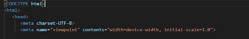
My meta tag code before
And I changed it to this:
My meta tag code after
I dragged and dropped the new folder to Netlify’s and waited. Nothing changed. There were no differences.
I am a bit hesitant to change too much just in case I muck things up. I have a saved version of the site but I was still scared
I tried changing the media queries and that didn’t have the desired effect. I then enlarged the fonts on the links, and paragraphs which did nothing.
I uploaded it again. On my laptop it looks awesome but there is no change on the phone. I did have one attempt that may bring some hope but I will need to make a compromise.
I could change the display from grid to flex but that will change the layout from this:
Blog in desktop view using grid
To this:
Blog in desktop view using flexbox
It may look better on a mobile and be easier to make it responsive but I worked hard on those irregular boxes and I am fond of them. I heard from a few places that there is no harm in using a personal website to be slightly different and to showcase what you can do. So, I am unsure, well, unwilling to make the change and compromise. The best thing to do, would be a quick cheeky upload to see how it looks.
One other thing I attempted was to change was the width of the intro section from 50% to 75%. I needed to do this in order to increase the size of the font.
Day total: 0 hours 51 minutes
Tuesday 15th March 2022 * /
I am still trying
Today I began started with the W3Schools JavaScript ‘const’ lesson:
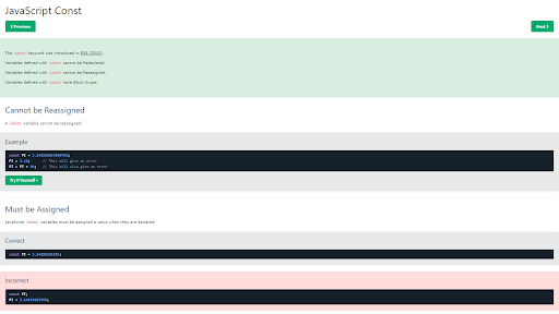
JavaScript const
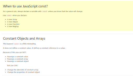
Some JavaScript information on constant, objects and arrays
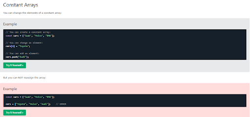
JavaScript arrays
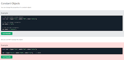
JavaScript constant objects
I will admit that I haven’t quite got my head around this JavaScript code. I am not sure what all these things really do in real life working models, so this week, most of the lessons have gone way over my head.
A reason could be that I am spending very little time and effort on these lines. Another reason could be that they are just lines, and out of context, they mean nothing to a complete novice like me.
But today something clicked. I get the statement side and the general subject and then there is the other statement that gives the details/specifics.
I hope I am correct with my idea. I am also hoping that as time goes by and I get to use more of it in a proper context, then I will improve my understanding and possibly my enjoyment.
I moved on to blog improvements and the responsive department. I have uploaded twice so far today:
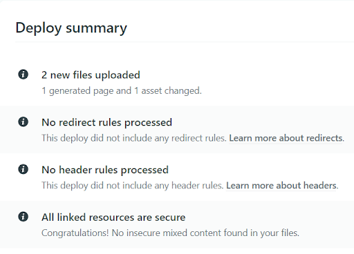
Netlify deployment summary
I've managed to alter the menu:
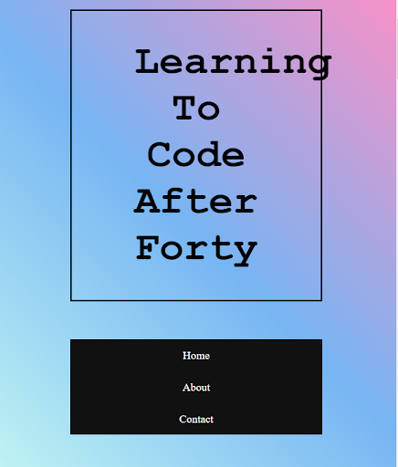
After I altered the menu
But as you can see from the above image, the heading needs adjusting. The real issue is that while the menu is responsive on my laptop as I narrow the screen, it is not like that on my phone.
I have used a free Code Camp article to try and make it responsive. At least one issue (the menu) is fixed but with the heading coming out of its box, I have ended up with the same amount of issues as I started the day with.
Did three uploads and I am unable to make the desired changes. The site is up and I will take a break from it for now. A break from things or a walk around the block usually helps - thanks Scott Tolinski.
It was the end of the day and I just couldn’t help myself from going to my diary entries and making a start on the 'October' page. This is where I noticed that I had not uploaded all of September's images and the last paragraph to the website.
I had been so wrapped up with things that I had not noticed that there were only three images in the 'September' page and a missing paragraph. I don’t know how I missed this man. I may have been wrapped up in the moment or just plain careless. Anyway, it needs fixing.
I went back to the code and added two more images, some image descriptions and that last paragraph. I had to resize the last couple of small images.
I have had this other issue for sometime that I still haven’t found a method to resolve. I don’t know how to add a line of code text and have it highlighted as red text on the page. Here’s an example of what I mean below:
Code text highlighted in red
The attribute code text above is highlighted in red. Whenever I try and do this, the code editor reads it as code and it all messes up.
I have googled this before and it was suggested to use a style property in the attribute which I may try I will another time.
Day total: 1 hour 05 minutes
Wednesday 16th March 2022 * /
Not sure what to say or what to label today
I began with some JavaScript‘ operators’.
What is awesome about JavaScript is that the computer does the working out rather than entering all the commands and the answer, you simple enter the commands and it performs the task.
It does the maths:
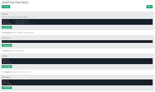
JavaScript operators
A list of the arithmetic and assignment operators:
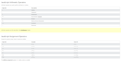
JavaScript arithmetic and assignment operators
Some string operators:
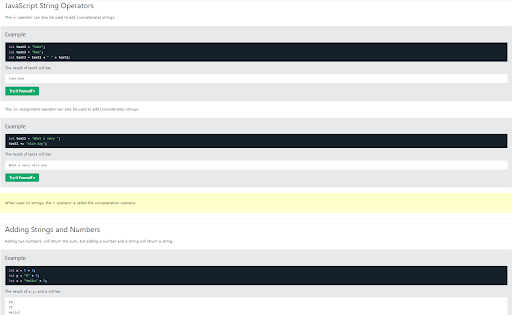
JavaScript string operators
I did make a few changes to the code to see what I could get up on screen. Then I attempted the five questions on the test. I got the first right, second wrong, the third right. I went back to revise and after, the forth and fifth were like the third so no problems.
Next I hit the blog. Last night I noticed that I hadn't uploaded some of the images and a paragraph to the 'September' page which needed sorting.
That paragraph contains attributes tags that I want to appear on the screen as red text. The trouble is that the VS Code wants to recognise theses lines as a proper lines of code and I haven’t found a way around it.
Also, a few months ago I tried to find a way to change the colour of the code. I revisited those sites again to see if I could find a solution. The first sight was W3Schools:
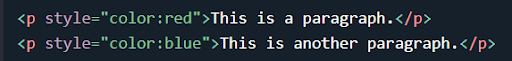
Inline CSS
They all share the same method, which is the inline style. I had issues with this method and I was unable to get the inline working for me. I just couldn’t get it to work. It seemed to be the pointy brackets because sometimes the text would disappear and sometimes it would affect the other text in the paragraph.
What I had to do is add a < p > tag at the start of the text, up until the < p style > then add a < p > tag after the CSS, like this:
The cat sat on the< /p> < p style="color:red">mat< /p >< p > and fell asleep.
This kind of worked by highlighting the singled out word but there were large gaps between the sentences and the words that was styled were no longer on the same line as the rest of the sentence:
The cat sat on the
mat
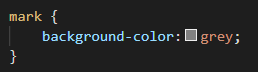
After a few more searches, I found Coding Dude who had the answer:
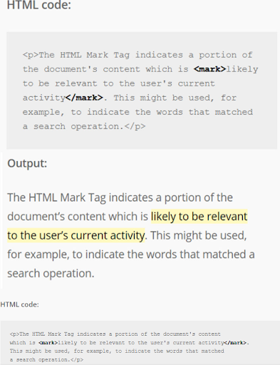
Coding Dude's solution
And the CSS:
The CSS code from Coding Dude
It was a perfect solution and simple. Thanks Coding Dude. It worked a dream:
My code using the < mark > method
I am happy that I have overcome another issue. One more issue down, plenty more to go.
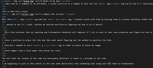
I removed all the unnecessary < p > tags. If you look closely, I even managed to find a way to have the <> (pointy brackets) at the end of the attribute:

My code using < mark >
I just left a space between the pointy brackets and the tag word inside. It came out on the blog like this after I added some grey styling:
An example using the < mark > tag
There were a few mistakes such as the highlighted text dropped to the sentence below and grey needs to be lightened up a bit but it is better than what I have achieved before.
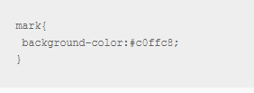
Here’s the CSS styling:
Simple CSS
I broke free from the blog for a bit and turned my attention to my wife’s site but I didn’t get far. Feels like ages since I have worked on it. It still looks okay but the big problem is that it isn’t responsive.
Responsiveness seems to be my new troublesome topic. I have been thinking lately that I need a mentor to just help me out and show me where I am going wrong at time. I feel like it is problem after problem to overcome and it takes me ages to sort each problem out.
I ended by searching for some non-copy right and free to use images that I can use for my own demonstration purposes on her 'about' page. Tomorrow is another day and I will give the site my total attention.
Day total: 1 hour 25 minutes
Thursday 17th March 2022 * /
A pleasant and unpressured day
I took it easy today. I’ve been thinking about things too much and putting too much pressure on myself to get as much done as possible in the short time I have. I do it quite often and it leads to unnecessary stress and actually less work.
I haven’t mentioned this before but my website in Netlify hasn’t updated. It also looks different in the web browser and the preview on Netlify. On my phone and my laptop, it looks like the old version but in my browser and Netlify, it’s the new version. I do not know why. It’s weird.
I did brief check up on web-kit to see if that was the issue and whether I need to add it. I’m unsure what web-kit really is. I know it is related to Apple and some web browsers and I’m wondering whether it, or the lack of it in my code, is having this effect. I do not know what to do.
Today I rolled up to the trusty laptop and told myself to relax and not to hurry or get slightly annoyed that things are not progressing as quickly as I hope.
A JavaScript ‘arithmetic’ page is where I began today.
I understood this page without any issues. I also got my head around the variables because there was an example of an answer where there were two ways of achieving it- one was using two numbers ( literal) and the other two numbers (or variable), so that helped.
I will not take any screenshots as it was pretty simple maths, using mostly some familiar operators to work out the sum.
After that, I turned to my wife’s website and the ‘about’ page. I went to shuttershock.com and saved some images for my own demonstration purposes.
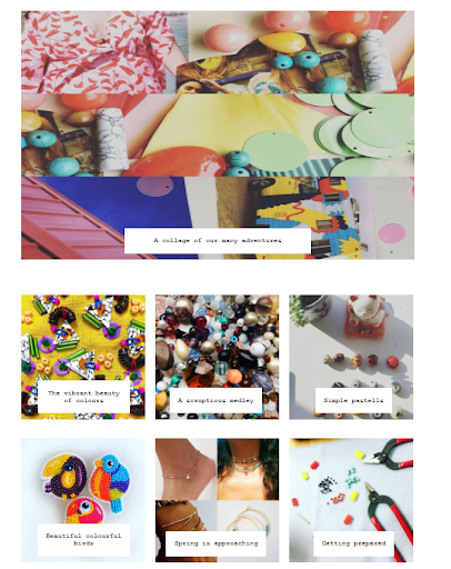
On the ‘about’ page, I have edited the text and now I have to try and float the images around in order to position them and the text. I’m not sure what I am aiming for at the moment. I have two ideas. The first is like the blog homepage where the months are in a card with the text around the image. My second idea is an centred image followed by a paragraph of text related to the image. I was copying the ‘Other Stories’ site, like my wife instructed, but I have gone a bit off - script and used an idea that I saw else where.
I will see what she says about my changes. As the text isn’t positioned properly, I thought about the idea of placing the text and image in a card to have better control of them both. Then all I need to do is either change the card the border white and invisible to the background or not add one.
It dawned on me that I should do this for the ‘shop’ page and then that may help make it more responsive. That’s the plan now.
I went back to the ‘about’ page on my wife’s website and added cards. I then returned to W3Schools to review the clearfix method.
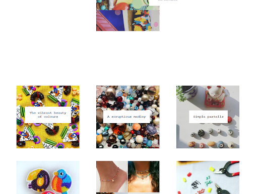
I renamed the cards to clearfix. Floated the images to the left and right and gave them borders so I could see them in full and have a proper idea of their size and the space they fill. The first one was perfect but the next three were in their own borders and surrounded by a larger border.
I couldn’t work out what has happened. I gave each image and text a name in order to separate them but nothing changed.
I called it a night and I will sleep on this one.
Day total: 1 hour 49 minutes
Friday 18th March 2022 * /
It may be time for a change of direction
Last night I was looking back into Bootstrap. I wanted to know what it was all about as I have encountered it a few times but I have steered clear of it.
The reasons why I have avoided it up until now, is mainly because I want to become good at CSS and HTML, and the only way I can do that is by learning and struggling with it myself by. Another reason for steering clear of it, is some advice from Scott el toro Tolinski, who said that frameworks come and go so do not be too reliant on them. He went on to explain that he believes it is best to get through at least your first ten projects by yourself, in order to learn the workings of CSS, and then start using frameworks after that. That stuck with me and that is what I have been doing up until now.
Last night I briefly looked at the Bootstrap site. Today I briefly looked at the Bootstrap course on W3Schools. The reason being is that I am not quite as good as I'd like to be on the CSS and HTML, and it may be a speedier way of achieving some good results and a refined looking site more easily.
A friend of mine who is studying computer science, said for speed and ease, many developers use Bootstrap. I suppose, I have copied other people’s code and adapted it to suit my projects, so, it doesn’t seem to be too different to using a framework and then adapting it to suit my needs. I will think about it.
Today, I didn’t do any JavaScript and focused solely on my wife’s website. I spent the first 50 minutes trying to sort out the border on the images and text from last night.
.
I have five images. Three are larger and are accompanied with text and the remaining two, are smaller images at the bottom with text. I decided to try putting each individual image and text in a card to have better control of them as one unit. I seem to be falling back on the cards, everytime.
I put a border around them to outline the card. The first card was perfect but the problem from last night was still here. The third, forth and fifth smaller images were fine. The issue was the border from the second card surrounded all the images from the second to the fifth.
The third, forth and fifth images were in their card, but within the larger and grossly extended second card. Once the screen size was reduced, the third card went into a scroll. Man, this is tricky
This frustrated me. I just couldn’t see what was wrong. I had each code in its own individual < div > and separate from each other. The first card was on its own at the top and it was playing ball. It’s just the second card that isn’t playing ball because its border surrounds the remainder of the contents. This is only noticeable once I place a border around the cards. If the border is removed, then the page on desktop looks okay.
The ‘about’ page doesn't look too bad, but as the page gets longer, the sidenav links float further down the page as though they are glued to a certain point on the page. Then when I add more content, that point gets pushed further down and the sidenav follows. This isn’t good, because when I am at the top of the page, I cannot see the sidenav and I have to scroll down the page to find it. That is definitely not user friendly.
I have a margin:auto; on the sidenav, but if I add a margin:top; to it, then when the screen size is reduced, the menu is placed below the header, which is then squashed between the contents and disappears.
I am really hoping that perseverance pays off and I really do get this at some point. I hope that point is sooner, rather than later.
The blog still hasn’t updated and remains the same old version with the 'September' month’s missing contents, still missing and no reduction to the nav menu.
Day total: 1 hour 35 minutes
Saturday 19th March 2022 *
Not much time nor much motivation
Slow and quiet was the theme today. I have been devoting all my spare time to the blog and the website, which means, I am at the point where I may need to reduce it in order to spend it on other projects and even some more studying.
I have an analogy which I feel explains where I am. When you learn another spoken language or skill, it is very easy to increase your vocabulary and learn many new words a day for quite a while. These low hanging fruit/skills are easy and give you a buzz but there comes a time when that slows down and the new set of vocab/skills require more time and investment. This is where the learning slows and the hard grind begins to appear.
In this period, improvement is less noticeable and it is determination and perseverance that push you through. I am currently in this position at the moment.
One of my reasons for learning to code, and specifically, learning to build websites, was for me to have more control and save some cash on my various projects. This would allow me to update and adapt their usage for my needs in things like marketing and the like.
Over the last few months, my life has rotated around nothing but HTML and CSS. I’ve had a strict routine of getting home, cooking dinner, washing, eating and then hitting the code with a few chores and running about in between.
It began to feel so good that I really started to believe that I could really begin to do this for a job in the future, but recently, I have come up against the wall and that has shaken my belief.
I changed my job at the start of January, which I had hoped would give me a greater clear period of time during the day to study. It has worked out pretty well, but it has been hard work due to the earlier starts. But, like the old adage says - ‘nothing ventured, nothing gained’. What I have lost in the luxury of free time, I have gained immensely, in a new hobby and skills.
I’ve been having issues with a few things like the responsiveness of the sites. I am also feeling the urge to return to the projects I put on hold so I could start learning to to build websites. These projects led me to starting to code. I would really like to return to one of these and try and see it through.
To do that, I would need to ease back on the study. There is only a finite amount of time in my day and a finite amount of energy in my body, that if one project gains, then another will lose. It is like that in life and the world, and it is like that for me. Decisions, decisions, decisions.
I have now started to add the text content to the blog which takes time and leaves me with less time to study and also work on the other websites.
I’m not complaining, as I have given myself an enjoyable, and at times, frustrating past time. So in my head I am repositioning things and my limitations. I now have many new projects to add to my other unfinished projects. I do not know where this is leading me but I’m going with the flow. And if in a year or two's time, if I am still at it and still improving then who knows?
The day began with JavaScript as I feel that a small amount each day will go a long way in the future when I finally get around to using it.
It was the assignment page:
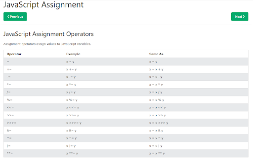
JavaScript assignment
I won’t go into more detail as it took me roughly six minutes to get through it.
Last night I again skimmed over the Bootstrap and googled a few questions relating to it. Today I returned back to Bootstrap.
I looked at the W3Schools site’s Bootstrap course.
It has three versions to choose from:
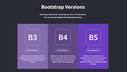
W3School's Bootstrap courses
I choose their Bootstrap 4 after some research and started on the course, which from the below images, is made up of many sections:
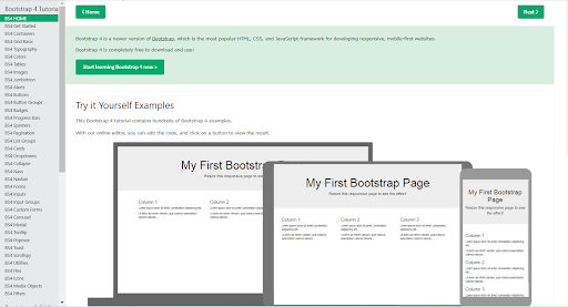
W3School's Bootstrap 4 course homepage
Containers was one of the first few section:
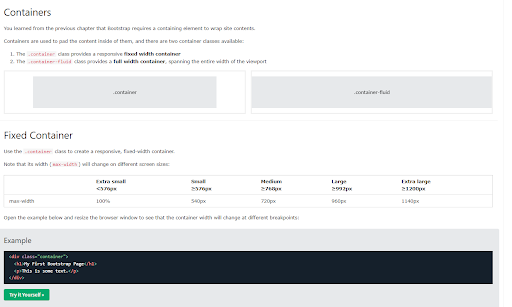
W3School's Bootstrap 4 container page
I am definitely glad that I have some HTML and CSS skills under my belt.
Next lesson was grid:
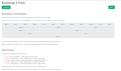
W3School's Bootstrap 4 grids page
And this is how they do it:
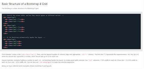
W3School's Bootstrap 4 grids' code
Typography was next:
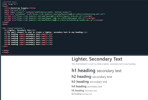
W3School's Bootstrap 4 typography code
At this point, I was thinking that Bootstrap isn’t what I thought it was. I thought I would have the option of different code of the basic structure and design, which could be copied and pasted and then adapted with the contents of choice.
I jumped to the nav section and then stopped. I looked at the Bootstrap website and took a look at some of the examples and read some information. Later in the evening I watched a Bootstrap video on Youtube.
Day total: 0 hours 31 minutes
Sunday 20th March 2022 *
Two consecutive days of limited coding and time
I only had time to complete a page of JavaScript on W3Schools.
It was titled ‘data types’ which were string, numbers, bootleans, arrays, objects and so on.
Not much to say about it. Still limited with my knowledge and at the beginning of the learning and so they are just meaningless lines that are out of context.
Even the test at the end of the page consisted of only one question. This weekend has actually come at a good time which has suited me. I feel like I have had so much HTML and CSS in my life that I can not see the woods for the trees. Maybe a break from it will do me some good.
Day total: 0 hours 16 minutes
Monday 21st March 2022 * /
Back to the grindstone
Today I got back on that bike and started riding again. A gentle ride to a page of W3Schools JavaScript all about functions.
I really didn’t feel motivated to do it but I got through it and even completed the four question of the exercise at the end. I will admit to not really understanding what I covered today.
The JavaScript didn’t take me long and then I changed lanes and headed to the blog.
I started on the October’s page. Yesterday I spent a few hours tidying up the saved blog entries and altering the grammar. I also went through the images in the 'October' entry to rename them in the order they will be used and in what month. I’m trying to find a system for everything as the amount of content which includes- text, images and links is increasing by the day. When all this is put together, it’s going to be quite vast and I need a system to keep it all in order.
Today I copied and pasted stuff into the page along with the images and the links. I am using Google documents so it is a long process of retrieving them, renaming them and saving them to the blog folder and finally transferring all of that over to the VS Code.
I once saw a video from a coder who advised bloggers to use an already pre-made blog as it is easier to update.
Man, he was correct. It is taking me ages, not only to rename and save the images, but putting in the < br > between the lines along with the < mark > and the < em > take time too.
The reason I am timing myself is because it is a real project I am working on. It is a long process but the experience is priceless. This is my book. When this is all completed, I am going to be so thrilled.
I am getting to learn some shortcuts and by repeating things, I am getting quicker. At present, I am just getting it all on the screen and I will go back and adjust it later. I am also falling into systems that work for me, through mistakes and the well trodden path of trial and error. The worst thing is when I discover a system that works and then I have to go back and redo all the content that came before it, in order to apply the system to the older stuff.
This project is awesome.
Day total: 3 hours 08 minutes
Tuesday 22nd March 2022 * /
I am asking myself a few questions
Started with the usual page of JavaScript on W3Schools and it was about objects.
Recently, I’ve been neglecting the blog site and my wife’s website, so today I was determined to give them both some attention.
I decided that a burger menu would be good for the mobile screen of my wife’s website. If it goes well, then I can use it on the blog.
I read a few sites to get an idea of what it entails and it’s quite a few lines of code that is needed. To test it out, I used the sample.html page to practise on. I pasted the ‘shop’ page and then copied and pasted the burger menu on to it.
There were clashes all over the place. I’m not sure how I am going to be able to keep the sidebar and then go to the burger menu on mobile view.
I removed some CSS and added some more in replace. I did have the burger icon up in the top left of the screen but it was empty and the real navigation links were still visible.
The list is piling up of things I need to learn and things I still don’t know. I am wondering whether I will master these things. I am now able to do the basic layout of a page but the responsiveness is something I am really struggling with.
I really do not want to go back and start again but something is telling me that it is the right thing to do. There is something that is just not right. Something I am missing or something I just haven't learned yet.
I need to get my head around these things pretty soon as they are now becoming vital parts of my projects. I need an ecommerce site and I am nowhere near completing a working one.
Perhaps, I should go back and learn the fundamentals of the knowledge I currently lack.
Day total: 1 hour 51 minutes
Wednesday 23rd March * /
A break may have had the desired effect
I continued the burger menu mission on the website. Googling a few questions, I eventually found a site that has a selection of ten to choose from. This article was by Luke Embrey on a site called alvarotrigo.com
Álvaro Trigo is on Code Pen which is awesome. I tried a few of the menus out from the article and I never realised there is so much code from such a small item.
One was in CSS and had the menu at the top of the page which was not what I was looking for. I pressed on with it as I thought I may be able to turn it into a sidebar. I also removed the colours as I didn’t want a blue navbar. Only trouble was that by removing the colours, I removed the burger menu. I carried on to try and sort it and add my links and my site but things did not improve.
The next attempt was titled ‘a simple centred hamburger menu’ by Álvaro which is awesome and perfect.
I added it and then introduced my code. I had to shift my images over slightly as the menu opens up on the side. If I didn’t move the images, the menu would open onto the first column of images on the left side.
I manage to keep the images as responsive but unlike before,ion which I had three images per row, this time I could only fit in two. I presume this is a result of the menu.
I went over the code to learn what was going on and there was a lot going on.I am happy with the adaptations I made as I haven’t broken it yet. A bonus is that it is a mobile first and semi responsive site now. I have a few more adjustments to make and some tidying up. I was also honest with my wife and told her that I am struggling with it and especially this hamburger menu.
I do feel a slight fraud as I did not code the hamburger menu and only copied and pasted it. I hope I can be forgiven for my borrowing and also butchering of it as I made my changes.
I will look at it again in more depth another time to gain a better understanding of it. I think by using frameworks such as Bootstrap, hamburger menus and other such difficult features would be freely available.
Big thanks to Álvaro who not only got me out of a sticky situation, but was also kind enough to allow novices such as myself, the opportunity to learn from him by putting his code out to the world.
The site I am trying to build is certainly difficult and more advanced than the skills I currently possess. But I will carry on and persevere. I hope that one day I will be able to put together and build features like Álvaro can.
Day total: 0 hours 32 minutes
Thursday 24th March 2022 * /
Something strange is afoot
I managed to sit down at the laptop slightly later than usual today. When I sat down and I was at ease. Strangely, I felt no pressure or difficulty when I started things.
I went straight onto my wife’s website. I saved the code since I updated the ‘shop’ page with the hamburger menu.
A few nights ago I watched a youtube vid from Web Dev Simplified about positioning in CSS. I thought I need to brush up on some of the basics that I never quit got to grips with. I thought this may come in handy for helping me position the various items on pages such as the one below:
A product page for the website
I think the card needs a rethink after I added the hamburger menu code. I started by experimenting on my sample.html page and adding the hamburger menu. I then added the rest of the HTML and CSS to the page.
Armed with some new positioning skills, I got ready to try my luck by starting with the parent and added position:absolute. The card went straight to the default position of top left and the text positioned itsself under the image.
I was nervous but also I was expecting this. I then messed around with the margins to position it in the correct place but this was not the correct thing to do.
I went back to the beginning and tried the self-align and align-item properties but to no avail. I was clutching at straws by now. The next attempt, I tried align-text: center; and it positioned it perfectly in the centre and at the top. By using margin-top, I was able to bring it down to where I wanted it:
The updated earring's page top section

The updated earring's page with full description
That was strangely too easy and pain free. I didn’t even need to make it responsive or add any more lines. The page looks simple and slightly bare but I heard it was good to embrace the white.
The next job on the list was to start on the homepage with the grid images. Not too bad here but after changing things, I was still struggling to make it responsive. I did manage to move the image grid over to the left to allow the menu some space.
I will work on it tomorrow and hopefully get the chance to do some reading tonight about adding the e-commerce bits along with learning more about the responsive grid.
Day total: 0 hours 47 minutes
Friday 25th March 2022 * /
Back to the classroom
Study was the course of action today. I started with a page of JavaScript ‘events’ on W3Schools.
I stayed on W3Schools and headed to a page titled ‘grid-view’ and all about responsive web design.
I have been trying to take a shortcut by using other people’s media queries for my code and I’ve realised that its not working and there are no shortcuts here. I need to understand this and tailor it to my needs and projects.
Anyway I started going through the W3Schools lessons and pages. Things didn’t get clearer until I started adding my images and played around with them and the media queries.
I began by having a few image to which I set three media queries for three different screen sizes. At each media query, I set a different value of opacity. Now was the moment of truth. As I reduced the size of my browser screen, the images responded and the opacity changed. I couldn't believe it - I had set three media queries and they work at the exact point I stated and with the exact preference of opacity.
Man, I was on a roll. I needed to step it up. Next, I targeted the size of the images. I set the first three screen sizes of the media queries. At each set screen size, I set the size of the image width. I narrowed my screen and it worked. It was a eureka moment:
The code for my image gallery media queries
The images set at three across for the first of the media queries.
Image gallery set at largest media queries
The image gallery reducing width at the second media query:
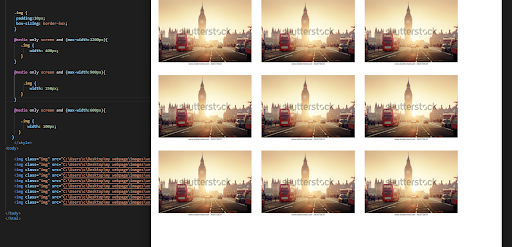
Image gallery set at second media query
And the final reduction at the three and final media query:
The image gallery size at the final media query
It wasn’t all smooth sailing. I felt that as I reduced the screen size, the browser reduced the sizes before my media queries had a chance to kick in.
Anyway, I feel so excited that I may have finally understood something that I have struggled with for so long and it's given me a real buzz.
I had a rush of blood to the head and I thought I was ready for anything, so I got the homepage screen up of my wife’s website:
The homepage of my wife's website
I went to work on it with my new media query skills, but it wasn’t long before I was brought back down to earth.
I couldn’t get it to do what I wanted. The design is a little more complicated and I need to learn more. It will have to wait until tomorrow when I am back from work.
I feel that I am under pressure to have this ready. Most of the pressure is coming from myself. I am getting there slowly but at times, I do wish I had more hours in the day to practise and play around with things.
Overcoming the media queries will be huge. This is a large hurdle and if I can understand this and the responsiveness, then I can sort not only the website out, but the blog too.
That will only leave the e-commerce bit to overcome.
Day total: 1 hour 43 minutes
Saturday 26th March 2022 * /
Time to start benefiting from the tools of the trade
That familiar feeling of going around in circles again. Last night a watched a a few videos on Youtube and one in particular by Terryl Brown titled ‘responsive image gallery using CSS grid’ stood out. It stood out because it had various sizes of images and the Terryl clearly showed the media queries. So I tried with my gallery.
But first, I continued on from yesterday and added the hamburger menu first and then spent the rest of the time adjusting it. I found it difficult to adjust.
By the end of the day I had just had the images on the screen and I wanted to move them over to the right to make room for the hamburger menu, for when it expands downward and to the right slightly.
I experimented with resizing the images and changing the grid-columns and the grid-rows. Another interesting fact with Terryl’s video was his constant use of the inspection tool and he really made good use of it to organise things. This is something I can learn from.
I tried mimicking him the best I could. From now on, I will use it more in the future. All I can say is that I need to watch his video again and I need to keep trying this technique.
During these last few weeks, there have been a few times when I would have found it useful to have had use of second screen. The first time I felt like this this was while uploading the blog on Netlify.
.
Again, these last couple of days, I have felt like another screen would have been beneficial and helpful for me. I am finding it hard work closing and opening and resizing screens now.
Day total: 1 hour 34 minutes
Sunday 27th March 2022 * /
Not sure if I really learned anything
The time I had today was spent on the blog entry for the month of 'October'. I managed to get from the 13th day to the 18th day in a few hours and man, it took some time.
I will need to go back and resize the images along with tidying up some bit here and there. I choose to spend the day on the blog, in order to take a break from the website.
Day total:2 hours 29 minutes
Monday 28th March 2022 * /
I’m hoping yesterday’s break will be good for productivity
Watched the youtube video by Terryl Brown again today and it is super useful. I get his explanation and demonstration of responsive websites and his use of media queries.
As he progressed through his video, I used the features and techniques he was demonstrating at that time, and immediately applied them to my code by altering it with another < div >, adding a few properties and adjusting some values. Low and behold, I have a rough responsive grid that breaks at the points I have chosen.
I didn’t want to get too pumped, like I usually do, and claim a premature victory, but the first break point works perfectly. I followed what he did to the letter and adjusted the three columns to two before entering the new grid-template-columns and grid-template-rows commands.
I cannot believe it, at long last and after many struggles - I may be on the verge of cracking it. I still have some way to go, because when I started my practice today, I kept all the images the same size to keep it simpler for me. The website, on the other hand, has the first image way wide than the other and that spans a few columns and below that I have two rows of three columns:
I kept today's pratice images the same size
And this is the actual website homepage. As you can see, the top image is way wider than the following images.
The original homepage where the first image spans a few columns
The image gallery down to two columns:
Image gallery in a two column format
Admittently, it is a bit rough and needs refining in a few places, but a working grasp of the concept is what is important. I will have to push on and tackle the first image. I did make a few mistakes which included the smaller images while in two rows of three. I had them spanning two columns (grid-template-column: 1 / span 2;), but because of their size, they only needed to span one.
I am pumped and feel the break may have worked wonders. There’s still a long way to go and the hamburger menu still needs adding. I am encountering a space issue when the screen narrows and the hamburger menu opens. I am sure that I will need to either drop the images further down in the rows or I will have to do something with the hamburger menu itself.
No time like the present. The list of ‘need-to-dos’ is large, so I attacked the first one and the first image. I had a go at enlarging it and it went okay. I followed that up by reducing it in size at the second breakpoint, only to discover that the second breakpoint was actually the final break point.
At the final breakpoint, I realised that I had a couple of imperfections. I am not sure if the images were doing something as a result of them clashing with something else or whether it was due to me not specifying their size and position, but one of the other lower images jumped up to partially cover the large first image and a scroll appeared as the large first image hasn’t reduced in size.
An image jumped up to cover the larger top image
That was it for today. I’m done.
I would just like to say thanks to Terryl Brown for edging me along a little bit closer towards the finish line.
Day total: 1 hour 21 minutes
Tuesday 29th March 2022 * /
Getting serious with two screens
I spent the first part of today’s session on the website trying to get the larger first image to reduce in size and it would only reduce slightly.
I have specified the size of the images in the HTML code, so I’m thinking I should try using the CSS to set the size of the images. I need the images to look their best on the screen, which meant I needed to find what size of image looks best at all three break points. I had a huge first image which would require the user to scroll down the page to see the images below and I know that’s not a great design feature.
I thought it best to come back and visit it again tomorrow and take the time to work out the best image sizes for all the breakpoints. I think I spent just short of an hour on the website and then turned my attention to the blog.
I spent a long time trying to get through the transferring and editing of the 'October' entry. It was helped by acquiring of a monitor from my son who had picked this up, and other computer bits, free from Gumtree. I bought a dvi cable and hooked it up. Check out my new set-up:
My new set-up
I tried a few variations and it was helpful. I certainly noticed the difference. It was a lot easier and certainly quicker to perform the tasks. So quick that I ended up deleting the whole month of 'October' in my haste.
I knew something would happen today, because, thank goodness, I took the precautionary step of pasting the code onto a document and saving it separately earlier.
While editing the blog stuff, I was noticing things that I had either skimmed or topics that I have forgotton I had covered all those months ago. I also notice how many of the little tricks and lessons I have covered over the last few months, which I have really used and put into practice or rarely used. I was pleased that I was using mostly the correct semantics HTML for the sections and for highlighting and emphasising text.
I Will carry on tomorrow.
Day total: 2 hours 03 minutes
Wednesday 30th March 2022* /
That circle feeling is back again
I spent time on the blog and then turned my attention to the website and specifically the CSS grid.
Last night I watched a video on a Youtube channel called ‘FollowAndrew’ titled CSS Grid Tutorial | Responsive Crash Course’.
It was really interesting and contained so much that I had previously encountered and have since forgotten about. I felt like I wanted to see if trying a few new methods of doing things could help me through some of the problems.
If I’m being honest, I’m finding it difficult to get this website right and especially responsive. Its getting to be a killer. I think my grid is all wrong and I need to explore some new ideas and routes to overcome them.
I am testing out the new methods on a spare sample file on VS Code as a precaution and not the real site. I am trying different ways to place my images:
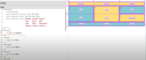
Grid layout
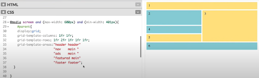
Grid layout media queries
I spent a lot of time on this but it just wasn’t happening. I used the developers tools to look for the grid and I improved the second and the third breakpoint ever so slightly.
The columns were difficult. The larger first image is tough to do anything with. I took the width and the height from the html and tried using CSS instead but nothing improved. In the end, I decided to remove it until I am better at this. It just didn’t happen today.
Tools down and I will try again tomorrow. I am still enjoying everything and messing around with this stuff, but my realistic ambitions are shrinking at every passing week. I am just not good enough at present to do the type of layout and styling that I’d like to be able to do. I will keep plugging as I do believe its just a matter of time before something clicks and I pick it up.
No giving up. Keep at it and keep learning and keep improving.
Day total: 1 hour 23 minutes
Thursday 31st March 2022 * /
Yesterday was a step backwards but today was a step forward
What a roller coaster ride this learning html and CSS is for me. It's a constant daily up and down with tears and joy. Of course, yesterday I hit another wall and I seemed unable to clamber over it. I admitted to myself that I won’t be able to have this website ready in time. I am actually wondering whether I will have a website at all.
I admit that I’m not ready yet, which is a bit of a downer. I am also slightly annoyed with myself that I haven’t progressed further in the amount of time I have invested in studying. This stuff is tricky and I take my hat off to the devs that make it look easy. I’m now hoping that after a year of study, I would be at the level I crave to be at this precise moment.
So today was about resilience and plugging away at things. I managed to complete the 'October' entry at last. It didn’t take too long to edit and proofread but the time consuming tarks were adding all the links and saving all the images. Finally, I have to go back and resize the images properly again and align everything.
Last night I rampaged through Youtube like a bull in a china shop. I was processed and watched video after video on responsive grid images. This led me to a few finds, and I found one in particular. Code and Create with a vid titled responsive gallery with css grid/How to create css grid gallery was an awesome find.
Even though it was my down time, I still popped open the browser to see if I could make even the smallest amount of progress at the eleventh hour. I can not seem to let this go.
I do not remember a time when I was so fixated by something and I was so desperate to know more and improve at it.
I followed along with my browser open and mimicked his every single step and it was easy enough. I have noticed that like anything in life, the experts make it look easy and if you want to get anywhere, you gotta graft.
The first mistake I rectified, was to withdraw all the inline width and height values from the HTML image code.
Once that was down, I continued following while Code and Create showed me how to make them all uniform in size.
What I noticed next was the amount of columns and rows he used. He used way more than I did. In fact, I’ve been trying to squeeze all my images into fewer columns. Code and Create was using the the column and row numbers to state when an image starts and ends, rather than what I have been using which states the image starts here and spans this many.
Both methods are okay but it was refreshing to learn and use this new technique. It helped to understand that using plenty of smaller columns is better than using a few larger ones. There were a few other tricks so go please check Code and Create and his responsive gallery with css grid/How to create css grid gallery.
I practised messing around with things to see whether I could get the stuff I learned, to work on my website. As I narrowed the screen, it shrinks everything accordingly. Awesome. Definitely a massive mistake setting the width and height as inline styles in the HTML. It made everything difficult and adjusting them a nightmare.
This is where I have got so far:
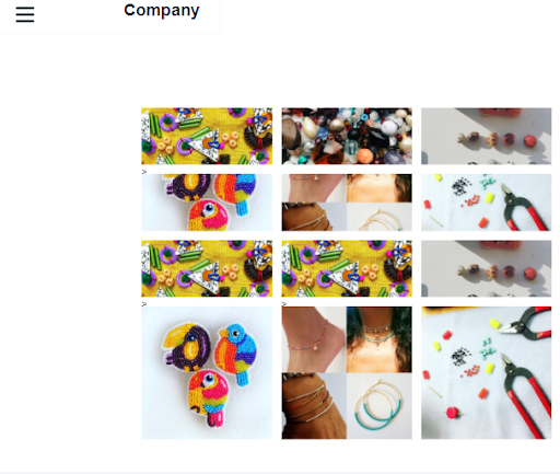
The latest homepage
As you can see, the large first image is missing. I have replaced it with three rows off of shorter images and and a row at the bottom of slightly taller images. I don’t want to get ahead of myself, but I will save this code and then try them with a media query to reduce the columns from three, to two and then one.
I’m Feeling good after today’s session which is a complete opposite to the way I felt after yesterday’s session.
A big thanks to Code and Create for edging me another step closer to something and putting your code online for myself and others to learn from and adapt.
Like last night, I just couldn’t stop having a go to improve. I had to go back and continue as I was on a roll. I adjusted the images and brought back that larger first image that I could not control yesterday.
Code and Create added the object-fit property with cover as the value and it worked a treat to stop any distortion and stretching of the images. I have seen it used many times and I did try it out yesterday but I couldn’t get it to work.
This is how is far I've got tonight:
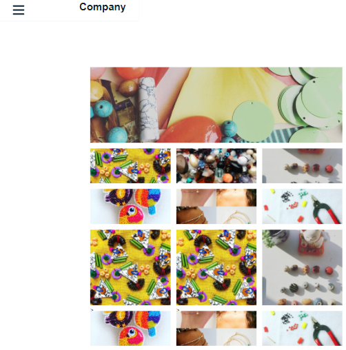
This is how the homepage looks so far
I set the background colour to pink:
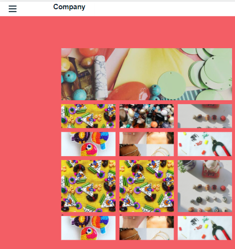
Homepage with background colour set to pink
Day total: 1 hour 56 minutes
Thanks for reading
LTCAF