Foreword:
Although every care has been taken to remove mistakes and insert the correct information, mistakes and mix ups do occur. If you find one of these mistakes, please forgive me.
At times, I found the experience of learning, documenting and transferring information to the blog very complex. And as I am only human I did get mixed up and made mistakes.
The website links, images, tasks and information were what I studied at the time of writing the blog.
Websites and learning resources are constantly improving and updating so I wish to let you know that they may have changed over time. What I studied and the links and images I have included may no longer be available.
I hope you find the blog entries useful.
Many thanks
LTCAF
June 2022
Learning the hard way but feeling like and idiot is worth it.

Worth every minute
Wednesday 1st June 2022
The projects are a coming
One page of JavaScript ‘scope’ was the first learning meal of the day.
Then I turned my attention to the 2 Old Planks website and started work on that. I noticed a few mistakes and a big one where the links from the 'project' page had not been done and the image paths were not correctly inserted.
I've taken home the 2 Old Planks' laptop and it doesn’t look the same as mine when viewing the mobile screens. I added a min-width and a max-width in the same media query for the mobile view and I’m not sure it looks right.
I found the size recommendations on a few sites including the W3Schools but I am not sure about it. It doesn't look too good on his laptop but maybe the site will be okay once uploaded.
I was then going to redo the grid again but instead, I shuffled things around. I still have a day until I am able to transfer his domain over from Go Daddy.
Day total:1 hour 37 minutes
Thursday 2nd June 2022
Finally
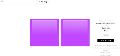
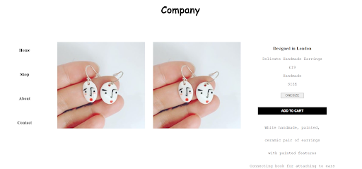
I managed to get the 2 Old Planks website deployed and live. It was a mixed bag with no fanfare in that there was the obvious good news but also some bad news.
It was responsive and all the background pages were great and lined up but the 'project' page that I used grid on was a bit wonky and the nav menu will need to be narrowed on the 'contacts' and 'about' pages.
It looks good on a tablet, so overall, not a bad effort.
Day total: 1 hour 07 minutes
Friday 3rd June 2022
Editing and transferring
After the subtle excitement of the underwhelming launch of the 2 Old Planks website, I spent the day trying to get some of 'November's' blog entry completed and tidied up on VS Code. I have allowed myself seven days to get it ready and uploaded.
My last job today was to finally sign up to Wes Bos’ ‘JavaScript30’ course.
Day total: 2 hours 47 minutes
Saturday 4th June 2022
Back to the drawing board
I immediately hit the ground running today and began by messing around with the 2 Old Planks website until I managed to correct most of the bugs. I did take my time and there were moments when I had to scrap what I was doing and start again.
I got there in the end but I’m not entirely happy. I also notice that I had a universal selector (*) in the CSS with a padding:20px;, which applied to everything and this is the reason I found it difficult to make changes to individual items. As a quick check, I changed the value to 0 and that worked its magic. This only leaves me to go through each item, section and element and adjust things individually.
I worked on a few other pages and almost finished them. I cannot see what the page will look like when completed from just using the developers tools. I will have to wait until it is deployed. I noticed that the screens on my laptop and the 2 Old Planks' laptop have different widths when the screens are reduced to their narrowest point. I know that my laptop browser will not narrow as much as a mobile screen.
I think there will be many more adjustments on the horizon.
Day total: 2 hours 17 minutes
Sunday 5th June 2022
I learned a lesson the hard way
While out and about, I was constantly thinking of ways I could improve the 'projects' page of the 2 Old Planks website. I thought of wrapping the images in a container and also I thought to apply the same styling as the actual pages of the individual projects. That was done with flexbox and is responsive and perfect. I googled nesting image gallery in a container and I found an example on LogRocket.
I’m not sure if it is the same LogRocket that sponsors the Syntax podcast. Anyway, a developer called Ibadehin Mojeed has a page of 24 stories of useful tips.
The article was really interesting and was titled 'how to create a responsive gallery with CSS flexbox'. It's super helpful and uses the same method as Jen Simmons’ flexbox idea which I used previously as it is simple and works. Only with this example, Ibadehin Mojeed uses an
< ul > as the wrapper which is useful to know.
Many thanks Ibadehin Mojeed.
I love looking at how different devs do things in a different way. It’s interesting to see that everyone has their way of getting to the same spot.
After I tinkered around and added the nav, links, footer and header, it was all great. The 'projects' page is updated and perfect now.
Next on the list is the ‘about’ page. I pretty much did it yesterday but I just wanted to apply a little bit more of my newly aquired flexbox wisdom to it. I removed one of the unnecessary < div >s and kept everything else.
Staying on the 'about' page, I kept a media query from yesterday that resized the images. The page has two smaller boxes containing text within larger boxes. I removed them all and replaced them with a border instead, which looked nicer - job done.
I learned that I was over complicating and over engineering things. Flexbox is simple and it can do things like wrap and be responsive without the need to try something more complex and adding unnecessary stuff.
I made it more complicated than it needed to be and that was a good lesson to learn. Yesterday I put in a few hours but I didn’t get to where I wanted to go.
Kevin Powell, Jen Simmons and now Ibadehin Mojeed have all reminded me how useful and simple flexbox really is and what it can do.
I need to keep it simple and start finding the simplest and best tool for the job.
Before I had to dash off, I quickly worked on the ‘contact’ page. I removed the two boxes of different colour (same as ‘about’ page) and inserted a border around the two sections of text. I then gave them a border and background colour with a display:flex; on the parent container and hit it with a flex-wrap, so no need for the media queries - job done.
Today was one of those days where the planets aligned and things just came together with ease. Days that I wish happened more frequently and days that I wish never ended.
I couldn’t stop and it was only the fact I had to go, which took me away from the CSS. I loved it and it felt so good. I've struggled the last few days and I was gutted when I didn’t get things right.
I discovered that a border-radius looks way more awesome and classier than my butchered effort from before. Taking away the sharp corners on the text boxes really adds something visually. I brought it over from the flex images in the project page and it’s what Ibadehin Mojeed used.
I was buzzing. The website is looking better and my visual styling is improving as the evolution of the sites gathers pace.
Day total: 2 hours 01 minute
Monday 6th June 2022
Ready to ride that train
I was so eager to get back on that ‘everything’s going my way’ train that I was on yesterday. For all the good feeling yesterday, I couldn’t wait to get in front of the laptop but circumstances didn’t allow me.
I was just grateful that I was able to get at least some time with the code. In that time I really used the dev tools and looked at what was happening to the live website.
I checked out other websites and compared their font size to what I am using. A while ago I saw that 16px was normal and in mobile view I have the < h1 > at 40px. I reduced the size of the < h1 > and the < h3 > font on the 'projects' page and the menu links.
Day total: 0 hours 33 minutes
Tuesday 7th June 2022
I feel like a dummy
The other day while working on the tips from Ibadehin Mojeed's 'how to create a responsive gallery with CSS flexbox' article, I noticed that he was using width:100%; and height:auto;. That night I checked out a few videos on Youtube and got the same answers regarding responsive images. I have no idea why I missed this and it is so simple.
I feel like an idiot and I don’t know how that slipped past me. Sometimes we can't see the wood for the trees and we learn the hard way. It was now a case of going back through the blog and adjusting all of the images.
With that lesson, I cracked on and made a start on cleaning up 'September', 'October' and 'November's' page. I have to remove all the unnecessary classes I had put on the images and just simply add the width:100%; and height:auto; to the < img > selector.
Day total: 1 hour 58 minutes
Wednesday 8th June 2022
Two days of feeling like an idiot
I spent my time on the 2 Old Planks' website today and I was determined to finish everything and get the new and improved site deployed.
Everything is looking fine on my browser and in the developer’s tools. Cut a long story short - I managed to get it deployed and live, 20 minutes before I started work. I was cutting it fine. I’m just thankful that this job is a few minutes from where I live.
I felt like an idiot yesterday regarding the responsive images and today I still feel like I'm doing something wrong when I take the old site off Netlify and replace it with the new site.
There's a window where the site is offline and I know this because I use my phone to check when the new site is uploaded. I just get this feeling that I'm doing something wrong.
In order to cause the least disruption to any visitors, I have chosen to do this very early in the morning before. I worry so much that the new site won't appear and I've broken it.
I then need to mess around with the domain and things like the DNS, which adds to the tension as I still feel like I don't know what I'm doing. I also have to edit the site's name so I know which one I'm working with. It's nerve racking and just doesn't feel right.
Anyway, there's only a few issues with the latest 2 Old Planks website deployment. The ‘about us’ page box is slightly too large for the screen size on mobile and the text is a bit off centre and to the right. The second issue is the social icons are not centred on my mobile view, but when I checked them on my browser’s developer’s tools - they are.
The third bug is on the ‘contact’ page. Two boxes appear next to each other in a mini version of the desktop view, rather than one being on top of the other in the mobile view. They should flex:wrap; and one should slide beneath the other.
I asked around to some different friends who all have different devices to get some feedback on what they can see on their phones. The iPhones don’t show the hover effect on the homepage is all I learned.
I am sure that 2 Old Planks are being nice by saying they are happy. 2 Old Planks have added the site address to their Instagram account.
Day total: 2 hours 14 minutes
Thurday 9th june 2022
Three days in a row of eureka moments
It was time to tackle the blog as it's a real mess. Since the last upload, I've noticed a few of the images on 'November's' entry are not showing so I need to redo their path. I also noticed that I forgot to add descriptions under each image in italics and when I narrow the screen, the text column narrows too much.
The code just looks like a trail of text that has been wiped down the middle of the screen. I have to sort this out once and for all.
I’ve been in contact with my friend in Canada and I’ve offered to build a site for him. He goes into the woods and likes to photograph mushrooms. I will build him a site to show off his work so I am stoked that I have a few projects to continue to work on and learn from.
I’m thinking that if I can get the 2 Old Planks site running perfectly, then I could go on a freelancing site and sell the template. That’s if I can get it right.
A friend of mine is over from Spain and we had coffee together. He has a Motorola phone and on his phone the ‘contact’ page is different to mine. He doesn’t have a miniature view but instead has two thin columns with overflow. That’s Interesting.
Another interesting point is that the 'homepage' hover effect and the 'project' page effect work on his phone, whereas I’ve only seen that on the laptop and not on any iPhones.
Tonight, I couldn’t help myself, but I had to have one last look at the ‘contact’ page. I had this inkling that as it was in a mini desktop view like the blog, I have repeated the same mistake.
Recently, I discovered the emmet of holding shift and !, then after, hit the tab button and all the metadata and < head > tags appear. I used this for every page on the 2 Old Planks' website and that has no mini view issues, accept for one - the 'contact' page.
It turns out that my spidey sense was right. Putting two and two together, I looked at the code for the ‘contact’ page and it turns out that I was correct. Now, there's no need to update the code. Instead, I just need to change the metadata and it should work as planned.
Day three of figuring out bugs. Now I’m left to just correct a few spelling and grammar mistakes on the 2 Old Planks' site which were discovered by his girlfriend.
Day total: 0 hours 55 minutes
Friday 10th June 2022
Back on the rollercoaster and feeling on top of the world
I was up early and I opened the VS Code to the 2 Old Planks' website. I changed the metadata on the ‘contact’ page, I corrected the spelling and grammar mistakes then opened Netlify.
This is where the long stressful process begins again - no man's land. The void between two worlds - the online world and the offline world.
I love Netlify, I really do, but it is something else I am having to learn by myself and by trial and error. I am still getting used to it and just learning slowly the correct way to do things. It’s easy when you know how but it is still nerve racking. The bonus is that it has given me this new life and joy (along with some short-lasting worry).
All these mistakes and feeling like an idiot has been worth it and it has allowed me to learn and move forward. I now have a website that only cost me time and a place where I can learn my trade and showcase my skills. Netlify has given the small business of 2 Old Planks a shop window for the world to see - all for free.
Thank you so so much Netlify. You are so awesome. I really mean it and I cannot put into words the feeling I feel, everytime I deploy a site.
This whole process makes me reflect on all my struggles as a self-taught hobby developer. There’s been so much to learn at absolutely every step I’ve had to take.
One of the toughest parts has been the fact that I’ve had no one to help me and only the internet to ask in order to overcome problems. Sometimes, that help and the solutions have taken their time to answer my calls. Sometimes, I have felt like the world’s biggest idiot but it’s all good now and totally worth it.
With the site back online, I noticed the 'contact' page is perfect and mobile responsive now. It was the metadata and it appears on the screen, exactly how I built it. The ‘about’ page still needs a wee bit of adjusting but it is nothing major and I can do that in the next few days.
The ‘home’, ‘projects’ and ‘contact’ pages are perfect. They fit the screen perfectly without any overflow or wonkiness. The cards on the individual pages tell the story of the projects from start to finish in a picture board type sequence. The images and the short text descriptions all line up perfectly. Many thanks to flexbox and all the developers that I learned from.
I just can’t tell you how pumped I am at getting this site completed and live. It's a great feeling of not only being able to give something back to 2 Old Planks in return for all his kindness in the past but I am so proud of the site that I designed and built with these two 49 year old hands. He loves it, which makes me more proud.
I have told him to let me know if he dislikes anything, absolutely anything. As it’s his site and I will not be offended if he wants to make any changes. This has been a real opportunity to learn and experiment with this project.
Eight months of hard work and agony. Eat, sleep and code (with the day job and other commitments along the way). I can’t stop checking the site out and thinking that I did that; I built that; that was all my hard work and my achievement.
I was pumped at earlier versions of this site and even my first few offline websites but this is different. This is almost perfect. I learned how to build it and also struggled with the intricacies of Netlify to make it go live. I have the ability to alter it and update it whenever I want.
This feeling feels awesome and such a powerful tool to possess. I love doing this stuff. I cannot wait to see how far I progress on my one year anniversary at the end of September and then what I can accomplish by my second anniversary.
Day total: 0 hours 47 minutes
Saturday 11th june 2022
I need some fun
I needed to just do something different today, so I decided to hit the CSS advanced and learn some animation. I thought that I might as well make progress somewhere rather than keep hitting that brick wall. Maybe it’s best to have a short break. I started on the W3Schools 2D transforms:
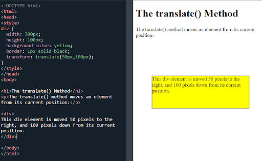
CSS translate() method
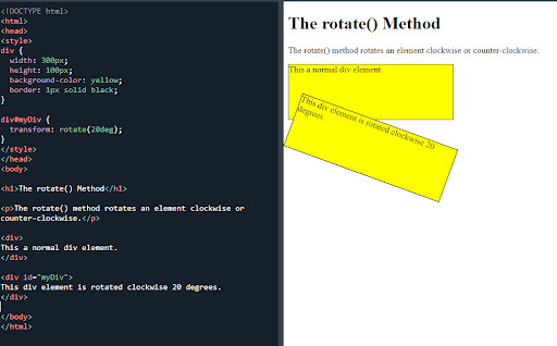
The rotate() method
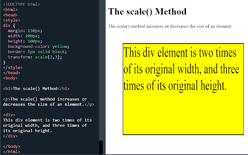
The scale() method
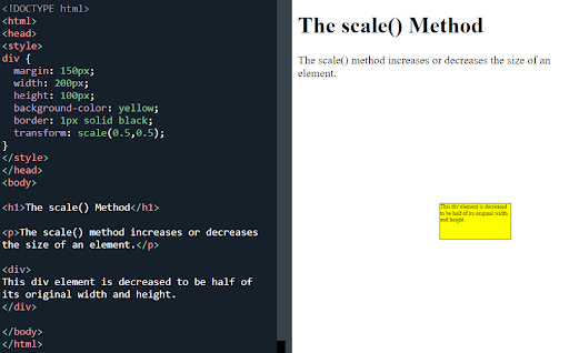
The scale() method
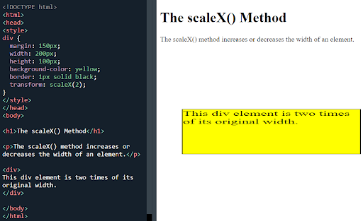
The scaleX() method
I lined them up to make some great shapes by adding a mirror effect and some colour:
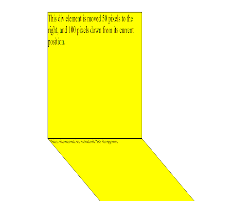
Making shapes with mirror effect and some angles
Next was 3D transform. 3D has the X and Y and also Z rotate methods:
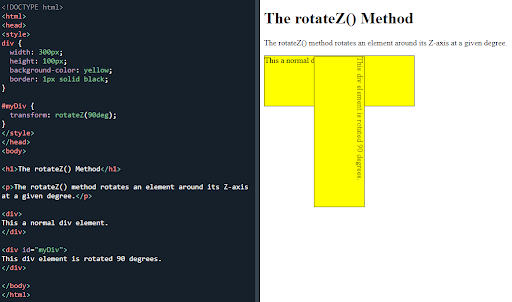
The CSS rotateZ() method
I had some really good fun with this. I forgot how much fun it can be by messing around with CSS. I think from these examples, I may get a better understanding of the transform, ease-in-out properties.
Glad I hit the CSS as that was fun and I needed it. Got some good feeling back.
Day total: 1 hour 42 minutes
Sunday 12th June 2022
Wes Bos time
I made a start on the Wes Bos JavaScript 30. I listened to the intro vid and the drum kit video followed by opening the starter files which were on GitHub and I began typing in the code of the drum kit:
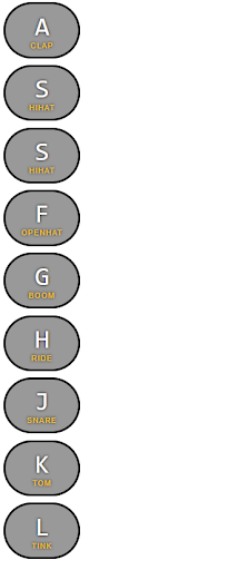
Wes Bos drum kit
I am terrible at understanding the correct way of doing things with new courses. He did mention to download a few bits but I was unsure of what to do and what I did was obviously not right.
I still have the grey keys vertically lined up on the left side of my screen. I listened to Wes explain a few things but I didn’t go back and see what I should download.
I downloaded the image (which doesn’t appear on my screen, even with the link path) and the sounds but I have placed them in a file which is separate from the usual file
where I keep all the stuff that appears on VS Code. Could this be the issue why my drum pads are vertical?
I spent the rest of the time sorting out the blog. I want to get all of 'November's' entry corrected on VS Code.
Day total: 2 hours 38 minutes
Monday 13th June 2022
Return to a mission
Yesterday, I decided to return to my wife’s site and see what I could do. At 4am over breakfast, I gave it the quick once over. It looked okay. The design and look of the site has advanced slightly and so too have my capabilities, even though this site is a few months old.
It was tidy and responsive. The images on the 'shop' page could do with a border-radius to blunt those edges. As I reduce the narrowness of my browser window, the hamburger menu kinda gets in the way on one of the pages. It also should be repositioned in the header as it is close to the side but if I move it in then it will clash with the content. This was the Other Stories' website I was tyring to clone:
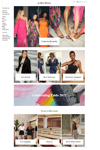
The'Other Stories' homepage
I took on board some advice that I heard ages ago. It mentioned to always make a hand drawing of the site on paper first and go from there. It becomes easier to see and count the columns needed. So I did just that:
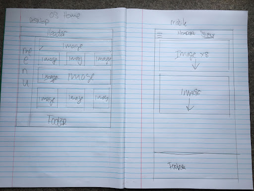
I tried designing the webpage on paper first
At work I was wondering how to do this. It was going to be grid and flexbox and maybe the two together. I read a bit more about one and two dimensional layouts and what works best from outer to inwards and vice versa.
I chose to go with the trusty grid at first, to see how the 'homepage' looked. I remember I had difficulty before with the side menu and that’s maybe the reason why every mobile page has a hamburger menu. Grid would give me that and this is what I got:
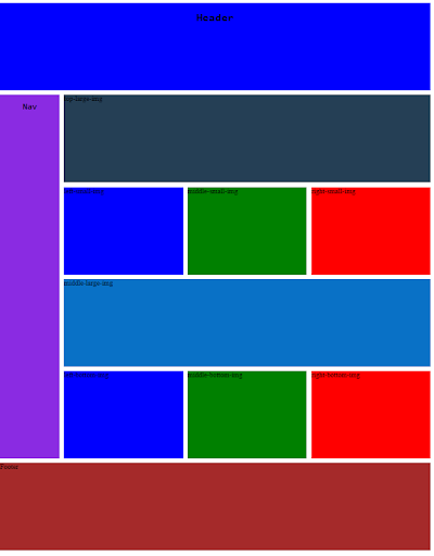
My CSS grid layout
It’s a bit out of proportion like the Other Stories’ homepage as I needed to shrink the screen size to fit it all in the screenshot. Here’s the CSS:
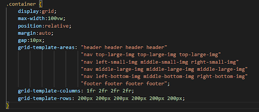
CSS grid layout code
This is the mobile layout:
CSS mobile layout
Not much to see as it is one column all the way down. Here’s the CSS for it:
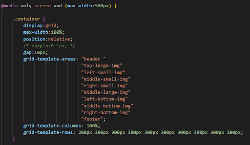
CSS code for mobile layout
This is how it looked after I added the images and text:
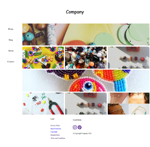
The new homepage with images and text
It’s a bit out of proportion again, due to me having to decrease the magnification of the screen so I could fit it in a screen shot. Compare it against the old one:
The old homepage with images and text
Visibly not too much of a difference but behind the scenes it's so much cleaner and less cluttered. I must say that doing it this way was a lot easier. It was more streamlined than last time I built it. I knew more and as everything was in containers, it was easier to control with a greater understanding of flexbox and grid.
I am also trying to make an effort to keep my code tidy. By that, I mean indented rather than all aligned, which helps identify the components and sections within it.
I don't think I have many best practice qualities but I do remember Jess Chan/Coder Coder mentioning this in a video at the start of my journey. I didn't pay much attention as I was more focused on trying to learn and get my head around things but as I've progressed, I've made more of an effort to do this.
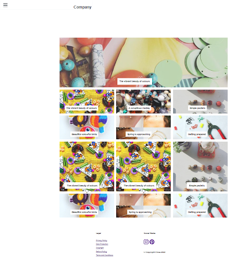
Mobile view without the hamburger menu
Day total: 1 hours 56 minutes
Tuesday 14th June 2022
All okay until I ran aground
Things went well today for the most part as I tinkered with the 'homepage' of my wife's website. I extended the height of the images, I added a fixed and then sticky nav to the menu along with some positioned text-block to the images. I altered the footer by putting the social media icons first and then all the legal stuff below and it looks good.
I moved on to the 'shop' page. I had an idea to use grid to lay it out and flexbox cards for the content in the content area. All of it was going so well with the grid until the cards were added and they didn’t act the same as the cards on the 2 Old Planks' website.
They were either a long row causing an overflow or a long column. I was able to get them to stay within the container and adjust to its width. I spent long enough trying to figure it out and then thought it was best to call it a day.
Day total: 1 hours 32 minutes
Wednesday 15th June 2022
I just couldn’t let it be
Last night, I had to have a look at the 'shop' page with the cards that weren’t behaving. I tinkered a bit and I am unsure what I did but the cards suddenly all lined up.
Today I added the footer to the ‘shop' page, altered the fonts and put in some links. I then made a start on the individual items shop page. This is what it looked like the last time I worked on it:
The previous product page
And this is how that page currently looks with the images and description:
The updated product page
It still needs work and is not yet responsive. It looks very much the same but behind the scenes and under the hood they are very different beasts.
Again, as with the other pages, the code is cleaner and less cluttered. In the first image, I had put in so many classes for things like changing the fonts, it was unreal. I have used grid to lay the page out and then flexbox with cards for the two product images and description.
It was definitely less complicated but that all comes from practice and trial and error (a lot of errors).
It is nice to revisit the lines I wrote previously and it is nice to be able to rewrite them in a different way using a different method.
Day total: 1 hour 09 minutes
Thursday 16th June 2022
A much needed fun day and some light relief
I returned to the CSS 'animations' page from a few days ago to continue from where I left off.
Whilst I was moving the box around in the example, I had the idea to see if I could get it to go around the outside of a larger box. I placed a black bordered box it in the container and centred it. I then added a red box to the mix and after sometime, I managed to get the red box to go around the central box.
I then enlarged the black border box and went to work bringing the orbit of the red box closer and closer to the outline of the central box. I was hoping to get it to follow the perimeter of the central box:
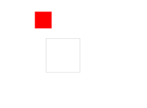
A red box orbiting another box
A red box orbiting another box, image two
A red box orbiting another box, image three
After a bit of tinkering to the size of the black bordered box and altered the measurements of the red box, I was getting closer with the orbit:

The red box orbits on the border of the other box, image one
The red box orbits on the border of the other box, image two
The red box orbits on the border of the other box, image three
While watching the animation, the red box looks like it runs perfectly along the perimeter line of the other box. This is until the screen shot shows it to be slightly off.
It was time to play ball:
A sphere orbiting the square
a sphere orbiting another sphere
And here’s the code for the squares if anyone is interested:
The CSS animation code
I'm not sure what this square orbiting another square was supposed to be
A circle orbiting another circle
I have many more images from my playtime but I'm not going to put them up. I had good time and it just reinforces my view that CSS is really fun.
I finished off by making a start on the W3Schools tooltip page which was the next lesson on the advanced list. I only managed to get through one exercise and that was enough for me today.
Day total: 1 hours 43 minutes
Friday 17th June 2022
Tooltips and content
I started by completing the tooltip page from yesterday and what I learned came at the perfect time.
Last night I thought I could put it to good use by using it to create something for the LTCAF social media accounts.
Then this morning, while messaging a friend who is putting lots of energy into his Youtube channel, I decided to make a start on it.
I couldn’t believe I’ve just used my coding skills to to produce a piece for social media:
I used the tooltip effect to produce some content for social media
I am new to content creating so this is going to be another great learning experience. I had trouble sizing the tooltip content for instagram. I had to make version after version to try and get it to fit the screen and also make it large enough to be read.
I called a stop to it. I had spent enough time on it and the list of more pressing jobs was growing larger and larger. I put it in storage for another day.
I like the fact that as soon as I had learnt some new stuff, I was already trying to figure out how and where I can use it.
At present my brain is speeding at one hundred miles an hour and I have all these ideas I want to explore and develop. These have all come from the ability to use HTML and CSS to make some web pages.
This skill has suddenly opened a gateway of opportunity to many possibilities. The only thing that is holding back the ideas is my lack of skills and knowledge to build and develop them.
I have this idea for an outdoors activity website and a mate who is currently making videos for his Youtube channel has offered to contribute.
This led me to doing some research and unlocking a gate to another route. I had a brief nose at similar sites to look at the layouts and designs. I looked at the features needed and this will take some learning.
If I'm going to use locations, then I may need to add map, which could mean embedding a Google map onto the page.
I watched a tutorial and then discovered some lessons demonstrating how to do it. W3Schools has a few pages on the subject so I’m happy about that.
Day total: 1 hour 07 minutes
Saturday 18th June 2022
A plan but no advancement
I am beginning to spread myself too thinly and do too many things. This is resulting in me not actually making too much progress with anything.
I am reaching a stage where I feel I need to push on and get slightly uncomfortable with some new stuff in order to learn and move forward.
I made a list of what I need to do:
I began with the Wes Bos JavaScript drum kit to get my day started.
I typed out the code again and started watching the streamed course as he explains what the JavaScript code does. I coded and followed along hoping to get a better understanding of what the JavaScript is doing and the reason for it to be there.
My wife’s site was my next target. I have the sticky sidebar but I really need a hamburger menu on mobile view. This is proving to be a tricky obstacle for me. I have her old site with only a hamburger on both desktop and mobile.
I set about trawling through CodePen and Google but I couldn’t find one that suited me.
There are many different hamburger menus and a few with topnavs that change into hamburger menus in mobile view but they were a bit too complicated for me. I’m looking for a sidebar that goes into a hamburger menu.
Ideally, I’d like a simply-ish one that I can break down and learn to understand the individual parts. It seems like there's a choice between a menu that uses only CSS and no JavaScript and one that uses JavaScript.
I had a nose around and looked at different ones. They all look complicated so I decided to just choose one and I tried changing it from a topnav to a sidenav but I couldn’t do it. Also, I'm not sure how to place the hamburger menu in the header once it appears.
The rest of the time today was spend adjusting the images on the LTCAF website and doing some more editing with the hope of making progress. I didn't time myself while I did this.
Day total: 2 hour 09 minutes
Sunday 19th June 2022
When I see the hamburger menu, I see toggle. It’s toggle time
The toggle and hamburger menu are my next hurdle. I really don’t get this and I’ve now had a few attempts at it. Going back to the ‘potty training’ metaphor, I’m really not sure whether I’m ready to fully understand and digest it and this could be why I’m unable to do it.
I thought I could do this quickly by copy and pasting an example and then make a few quick changes, but, last night’s attempt made me realise that I need to understand it and that this is my next hurdle.
I was excited to get started and googled a few things over breakfast. I found many sites with lots of menus, both short and long and complex and less complex. I saw many with JavaScript
and now is the time to end the running.
I have watched the stream on Wes Bos' JavaScript 30 where he explains such things as the addEventListener and the querySelector so I have a little understanding as to the purpose of these lines and what they do but I lack the full understanding of them.
FIrst I hit W3Schools and toggle switch:
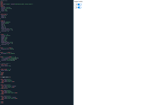
Toggle switch exercise
Next was 'toggle/swap text' which has some JavaScript that I'm slightly familiar with from other exercises:
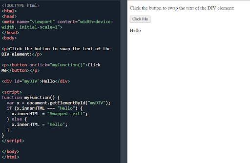
Toggle/sway text exercise
Once clicked, it does this:
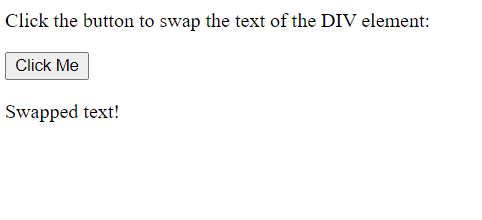
The toggled text
Next up, I tried a hamburger menu from Ljc-dev which was one of the simplest I could find but still above my skill level. It took me a while to correct everything as it didn’t work and look like it was supposed to do at first.
It is perfect and exactly what I want. It takes up the whole screen. Now I have to work out how it will only appear on mobile screen size.
I played around with it and I tried a few things but I need more knowledge and practice, especially in the JavaScript department. I did find another site but no time so I will try it tomorrow.
Day total: 1 hour 39 minutes
Monday June 20th 2022
I was expecting it
I am trying to get over this hurdle of the hamburger menu. It is going to take me some time to do it. I saw a reply on a forum which suggests using Bootstrap. The post said that there was no need to learn how to build one when they are already built and available on Bootstrap.
I am going to push on and see what I can do. I saw an ad on Youtube about learning and it said that it is not how much you spend learning, it's how you spend that time.
I am sure that’s right to some extent but I am also self-learning so I can expect some inefficiencies and plenty of time spent on stuff. I am going to push on as the answer usually appears at some stage.
Today I tried to merge Ljc-dev's hamburger menu with the code of another hamburger menu which has the sidenav. I wondered if I could use the sidenav one and then get is to change to Ljc-dev's on small screens. I thought I nearly sussed it but it was not to be.
It got messy and I essentially lost the use of both of them. I will keep going.
Day total: 0 hours and 58 minutes
Tuesday 21st June 2022
Another day another hamburger
I was searching around Google and Youtube last night and today for another hamburger menu example.
I think that some things are becoming slightly clearer (only just slightly clearer). I have this feeling that if I keep pushing on and persevering the curtains will open and reveal a clear sight of what I am aiming for.
I found another hamburger menu and tested that out. I just went through it and read what they had to say. I wanted to understand what was going on rather than how it was being done. It sort of helped a little.
I then found a Youtube tutorial explaining things and again it helped slightly. I had this abstract idea in my head of how and what was needed to be done but I couldn’t understand it enough to turn it into a clear idea.
Edging forward, I tried a kind of hybrid version by incorporating it into my wife’s site but that was a total no-no. What did become clearer today, was the display: none; which will hide any element it is used on. I practised using it in the styles and in the media queries and managed to get it to work.
In the Youtube vid, a Font-Awesome icon was used which I always find difficult to use. Instead, I decided to go with an SVG and chose one from the many sites on offer but when I used it, it didn’t work either.
I carried on and got a box outline of the menu and I managed to place where I wanted it. I was then able to make it disappear. That is as far as I got today until I gave up. But I couldn’t resist one more try.
I found I had made a mistake. To cut a long story short - I had used display:flex; instead of display:grid; on the container which resulted in the page being not responsive and the < h1 > tag and the sidenav would appear part way down the screen.
I changed it and they appeared where I wanted them. Now I have a < h1 > and a square shape in the header on mobile view and the sidenav on full screen. That is a step forward and a small win which I'll take.
I finished up by spending time on the blog. The whole thing is a mess. It is the project I had hoped it would be. A place to try out my fledgling skills where I can make mistakes and learn so many valuable lessons. This is why I have been doing it and the reason I set about building it and deploying it.
As I'm working on it, I see so many mistakes that I need to change and areas I need to improve in. That takes so much time change things on a page which has nearly 1700 lines to sift through.
Scott Tolinski mentioned something to the effect of - 'the last 10 percent can take 90 percent of the time.'
This is where I am learning and earning my spurs. It's all glamourous building navs and headers and adding a lovely font, but you have to do the grind of the little bits and pieces to see it through.
An analogy would be a restaurant kitchen. After the prep, you hit the fun bit where you cook and serve up the beautiful food. After that the cleaning and clearing up begins. I’m doing the clearing and cleaning up all the time.
Day total: 1 hour 27 minutes
Wednesday 22nd June 2022
Not much time and not much effort
Didn’t get as long as I wanted today to hit the study or the projects. When I sat down I really felt energyless. Instead I finished off the Wes Bos JS drums.
I couldn’t find the file I had it in so I made another copy. I played around and increased sizes and speeds to see what it all does. I found that if you hold the button down long enough the box stays yellow forever:
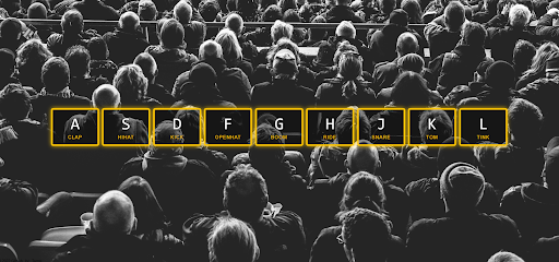
Wes Bos' keyboard
Next, I wanted a hamburger menu and so I turned to the CSS Evangelist Kevin Powell. I opened his CodePen and then his Youtube vid and followed that for a bit.
I typed in the code and followed along. The only issue being that his nav is in the header and mine isn't. I followed along in the hope that I can make some adjustments later but mainly to see how he uses only CSS and no JavaScript.
I always feel a bit daunted by the hamburger menu and I’m desperate to understand them. I think it kind of represents my present skill level and understanding. As I don’t understand how they work or how the code works, then it’s a reminder that I’m just not up to that level yet. I’m not ready to be 'potty trained' again.
As I was zonked, I should have just set an easy target today of the hamburger menu rather than pushing to do the Wes Bos JS drums and then make a start on the hamburger menu,
but I pushed on and followed along with the CSS Evangelist.
Kevin Powell makes it look so simple. I typed along and stopped at sections to delve a little deeper into what was happening. I didn't get far but it was nice and clear to see the stages and building up of the nav and the positioning of the links. If anything, he made a nice looking header and nav.
Actually, it turned out that I managed more than I thought I would.
Day total: 1 hour 26 minutes
Thursday 23rd June 2022
An urge
I've changed my job a fair few time this year and at the moment I have a few jobs that are broken into smaller chunks which are spread throughout the day,
starting at 05:30 and ending around 20:00
This means I'm finding it difficult to get into a long groove and be able to stay on one thing for a big chunk of time. This hasn't stopped me and I am finally hoping to deploy the improved 'November's' entry either today or tomorrow. I wasn't needed at a late morning gig which helped clear my schedule. Time to take advantage of the opportunity.
This week, I've listened to an episode of Syntax where people submit their websites for review. I suddenly got this urge and increased urgency to sort out the blog.
I thought that if I can improve it, I may even go as far as submitting it for the judge and jury to critique it.
It's three months old and I have done nothing to it apart from stare at it, try to update date it and think to myself that I need to fix it.
I want it to be a success and look good. It’s my first site and I want this site to be a project that is useful; a tool that works and has a purpose from where I can learn; a learning experience where other people could benefit from my experiences.
Over the last week I've checked the paths and the alt for each image and removed so many unnecessary < div >s. Going back over it, I had discovered that I had each image wrapped in a < div > and each had two classes, each section wrapped in a < div > and
< div >s wrapped in a wrapper but with no containers or widths set.
I really don't kow what I was doing. I'm sure it's as a result of not being able to make images responsive. As I'm over that issue, it all has to go.
I added new metadata and descriptions at the top of each page. Before, I had a < p > tag at the begining and end of the paragraph. This time, I've decided to add one at the beginning and end of the sentence.
Adding all those < p > tags had taken ages and that was a long process. I've added a new font which seems to have more space between the lines. And as I've added more < p > tags, it too
adds more space between the lines, so now I've had to remove all those < br > tags. It wasn't too enjoyable correcting everything but when I look at it - it looks loads better
Finally I got it done and deployed and it was a partial success. First thing that I noticed by looking at my phone was the links in the navbar and the 'homepage' were slightly off centre. I wanted to check it against another device so I looked at my wife's phone which is newer and has a larger screen. Things were perfect on that.
I was a bit gutted but I will go back to the drawing board and add a media query for smaller devices. Also the web address has a .index after the .com which I'm not sure it had before.
At least it is responsive and the month entry looks perfect.
The images are perfect, the font size is spot on and I altered the 'homepage' a bit but that will need redoing another time. Not bad and I'll take it.
It is always stressful uploading the updated site to Netlify and I still get the nerves. I think it's because I care so much. There's also so much that could go wrong and does go wrong.
I have the list of things to check like the image links, but I always miss something.
Since its up, I am not going to tinker with it again today. It was now time for the CSS Evangelist and get some more practice with the hamburger menu.
It's a great looking header with loads of little intricate details. Again, I loved the positioning of the nav links and the different layers from the appearance of the links and their starting position in the top left corner. They then move to the centre and then back again to the corner, where they finish up a bit further down on the left hand side than where they started.
Kevin mentions to start using < em >s and < rem >s. Something else to go my list.
CSS Evangelist makes it look so easy and he has his preferred methods which only come from years of experience and knowledge.
Day total: 1 hour 51 minutes
Friday 24th June 2022
I'm not ready
It's the end of the week and today is a slow day. I really pushed myself to go over the Wes Bos JS drums again.
I'm not sure what it is but I've struggled with the JavaScript. I don't feel as enthusiastic with it as I did when I started learning CSS. My interest hasn't been sparked and I am not sure why.
I'm not sure if it because I'm just doing the lessons and haven't really tried using it on stuff yet, or whether I'm just not ready. I also know very little about JavaScript. I don't really know what it does or how useful it is.
Anyway, I went over the drum lesson again and just focused on the HTML and JavaScript code on the JavaScript 30 drum kit github page.
I did my thing of going over the lines and memorising them. I looked at how the JavaScript linked up with the classes in the HTML.
I spent 45 minutes on it and that was enough. I'm coming to realise that I am not ready yet. I'm trying to do too many things and not doing anything well. I have very little time and I'm really pushing myself to eak out more time to practice.
I have to be honest and say that I'm still struggling with the CSS. I should improve at that first and refine it before I take on other challenges. I think I'm trying to run before I can walk. Getting a bit of exposure is beneficial and I hope it will help in the future.
I'm also trying to juggle my wife's site whilst learning JavaScript.
I think I should do less of the JavaScript and stick to the CSS and progress with that.
I also have to sort out the LTCAF website and finish off the entries. I will return to the JavaScript in a short while.
Day total: 0 hours 45 minutes
Saturday 25th June 2022
Took it easy today
I had some things to do today, which meant that I was unable to spend the day playing around with the code. Before it got busy and I had to rush off, I decided to immediately get stuck into something.
I took it easy and did some tidying up on the LTCAF website. At the moment, I really don't know what to call it. It's a website but the diary entries are blog posts.
Anyway, I plugged away at that for a while and then moved back onto Kevin Powell's hamburger menu, knowing full well that I wouldn't have much time on it.
I opened his CodePen and then his Youtube and went throught the code again with the hope of understanding some more and with the pressure off.
I love working first thing in the morning. I feel alert for a brief window while things are calm and quiet. I moved through it as I have done before. I'm beginning to wonder whether it would be easier to use JavaScript
than CSS, but as I'm not too experienced at either, I didn't make that call.
Day total: 1 hour 14 minutes
Sunday 26th June 2022
A new direction
Forget the JavaScript. Forget the hamburger menus. I'm changing course.
Last night I was looking around at website templates and reading about frameworks. They look so good and classy and the designs are simple looking and so clean and modern.
As I looked around, I ended up at ol’ trusty W3Schools. W3Schools has been my go-to for much of the last nine or so months and usually the first port of call for exposure to new CSS things.
Not everything I have needed has been on it but it is reliable and vast.
I like the style and the lessons. I just connected with it and found that it worked for me to understand the basics of CSS. It's a gentle introduction into new stuff.
I ended up on the template page and this
template in particular:
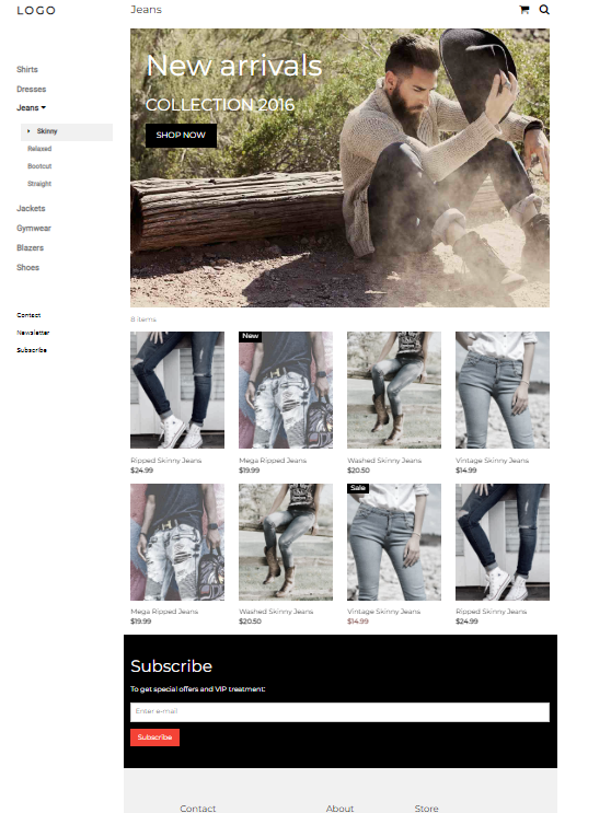
A W3Schools’ website template
I started typing it out and the code and practising it. It looks so different and it feels grown up compared to what I usually do. Different styles and layout of code - wow!
I noticed there is so much new and different that I don’t know where to begin. I'm going to push on with the grown up stuff.
I'm going to see what it looks like when done and break it down and see what I can change. It looks perfect, not only for the site but for taking me forward and learning some new stuff.
I’m surprised by my first framework. I found the templates new and interesting. I read up on inline styles for a bit of a refresher and to check out the pros and cons.
As I was typing I was trying to get my head around the code and it was not easy. There was stuff that I had never encountered before. I thought that I have finally entered the grown-ups' world:
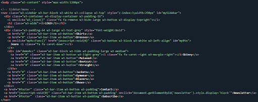
Some code for the above W3Schools' website template
Seeing code like w3-col l3 s6 was new and fascinating:
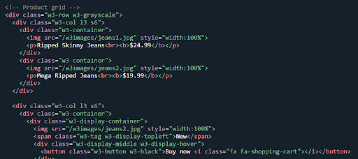
Facinating website template code
I had no idea what this was so after I had completed the pages, I wanted to know more, like how were the columns in the footer built because they looked awesome and I wanted to learn how to do it myself. Reading about what was on offer from the W3Schools W3.CSS page, it explained that its framework is simpler to use than bootstrap. It went on to say that it was free to use, adapt and had no license
I quickly read an article comparing Bootstrap to W3Schools' W3.CSS and I was happy. It seems like a good place to start learning a framework. I also remember quite a while ago learning a bit about the columns and stuff on Bootstrap and how to adjust them. I hope it is similar here. Anyway, it sounds good and I’m in.
Okay, that sounds great and I’m thinking that it may be the time for me to use this stuff as it really is a league above what I am capable of. I had typed it out but I had a lot of bugs and not all of it worked and of course the images didn’t load.
I set to work adapting it and it was fun and straight forward. With the knowledge and skill I've learned, it was easy to remove and alter the small stuff like the text. I had one image a bit out of line so not sure what happened there.
I uploaded the images I wanted and changed the titles and text. I added a class to my wife’s logo image and then used that class between the style tags to bring the opacity down. I altered the sidenav by changing it to the items I wanted. I took off some of the footer links and social media links. I removed the contact form but that shrank the grey box behind.
This is the original:
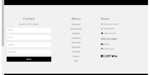
The original footer
And this is what it looks like after my alterations:
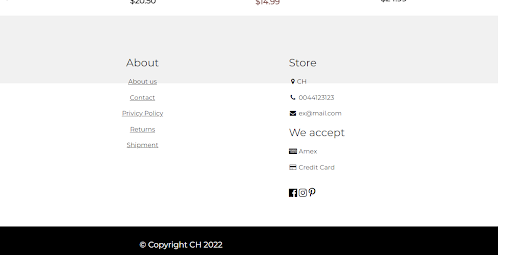
The footer after my alterations
Once I removed the contact form, the columns shifted to the left and the grey backing shrank. I moved the columns slightly to be more central but I wasn’t able to enlarge the grey backing.
I had another attempt again later:
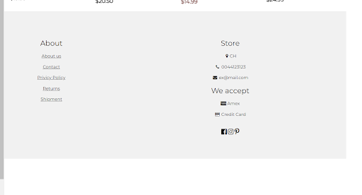
A further attempt at the footer
And it’s slightly better.
I enjoyed it and to top it off - it looks well nice.
Day total: 1 hour 31 minutes
Monday 27th June 2022
So much to do and so little time
I googled last night whether using a framework is cheating. Almost all, seemed to answer that it wasn’t and that it was okay to use them. Most mentioned that it speeds things up and saves time. To me, it does feel a bit cheating, especially as I've yet to master the basics of CSS
and build stuff like a hamburger menu yet.
Ages ago, I remember Scott Tolinski saying that it was best to learn CSS first and use it on your first ten projects. After that, go and learn a framework.
I’m still learning and I’m in two minds as to what to do.
I’m going to have a look at the W3Schools’ W3.CSS framework and see if it helps me. I may learn something and it may speed up the quality of my sites appearance.
I began at the beginning of the W3Schools’ W3.CSS framework tutorial.
I wanted to learn more about making the adjustments. Last night I looked at the containers and a half and half screen is s3 s3/ 50/% for each side. I’d like to understand how to make different pages like an 'about' and 'shop' page that I could use on other projects.
I found it pretty straightforward and zoomed through it. I copy and pasted the code many times to build up the page.
I should have started on the more complicated bits where the adjustments and the custom stuff goes.
Day total: 0 hours 51 minutes
Tuesday 28th June 2022
W3.CSS all the way
My aim was to get learning on the W3Schools’ W3.CSS framework so last night I watched part of a Traversty Media building a site using the W3.CSS framework.
He made it look effortless as always. I started at W3.CSS intro and had a quick rummage through some of the skills down the page and in particular - the W3.CSS sidebar.
I continued following Brad Traversty’s W3.CSS framework. video while doing my thing with the adaptation of the site. I had similar sections where an image would have some text and I had similar topnav, except I went for a dropdown menu.
Things were going well and it all seemed quite straightforward and logical until I got to the image. Brad Traversy used an image URL but I used a saved image. He had his image URL in the CSS and I had an < img >
tag in the HTML.
I copied his things but it only looked good on a small screen and that was written in the styles (w3-small). When on a large screen, I wasn’t able to scroll down the page or see any visible text on the images.
I had to remove some stuff. I added the responsive text and it does what it says but still the image is only half visible and the page doesn’t scroll.
I tried other images and they were too small with the text below. I added more sections by copying and pasting but still no scrolling.
I spent ages on it and couldn’t work out what the issue was, so it was time to call it a day.
Day total: 1 hour 27 minutes
Wednesday 29th June 2022
Teething problems
Before bed last night, I investigated why the page didn’t scroll. I did find one answer but it wasn’t the answer to my problem bacause I tried it. The answer was simpler and I was able to find it myself because I’ve been here before. The answer was a missing closing < /div >. Simples - I got there in the end.
Today began pretty smoothly as I added more sections. The difficulty came with the design. I’m still not great at the design so I had to have a look around at other sites to get inspiration and to see how things should be done and look.
Also writing the text is another hurdle. Looking at other websites but never really seeing how technical they are and how many complex details go into making the site look great.
I also googled whether it is permissible to use the W3Schools’ W3.CSS framework for commercial purposes. The framework seems easy to knock together a site in reasonable time, which raises the question - could I then sell those sites/templates?
The answer seems to be yes to commercial use but to the selling templates will need further investigation. I did see a link mentioning MIT and their licence on GitHub.
I managed the fixed menu, a large image with coloured background and another section saying a bit about the site and that was it for today.
Very enjoyable day
Day total: 1 hour 03 minutes
Thursday 30th June 2022
It’s straightforward but not straightforward
I continued messing around with the W3.CSS framework today and I started to put together the homepage of the activities site. Ideas are coming out and I have a picture of what it should look like but I am making most of it up as I go along.
I’m placing the w3-containers, then as I need to change things, I either want to add something or move something and so that involves finding something else to replace what I removed.
I have a section container under the menu bar which I decided to place an image in. Once placed, the image didn’t work as it wasn’t large enough and it wouldn’t centre.
After that idea didn’t work, I decided to split the section in two and have the left half with an image and a red box on the right with some text. I found the text on the small screen difficult again.
I gave the text a class which I had seen Brad Traversy do when he wanted to change some elements. Unfortunately, that didn’t work as I had hoped either.
My next move was to remove the dropdown list which contained the list of the four UK countries and replace them with a grid of images for each of the four nations. That didn’t seem right either, so I scraped that in favour of just having the counties of the UK and their coat of arms:
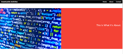
A text and image section using W3.CSS
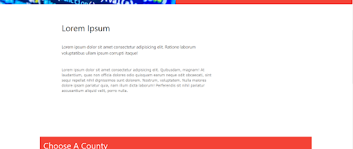
An intro section
Day total: 1 hours 49 minutes
Thanks for reading
LTCAF