Foreword:
Although every care has been taken to remove mistakes and insert the correct information, mistakes and mix ups do occur. If you find one of these mistakes, please forgive me.
At times, I found the experience of learning, documenting and transferring information to the blog very complex. And as I am only human I did get mixed up and made mistakes.
The website links, images, tasks and information were what I studied at the time of writing the blog.
Websites and learning resources are constantly improving and updating so I wish to let you know that they may have changed over time. What I studied and the links and images I have included may no longer be available.
I hope you find the blog entries useful.
Many thanks
LTCAF
February 2022
A new day and a new month but the same old issues

Evolution of the website
Tuesday 1st February 2022 * /
Things are still not aligned
I sat down hoping to figure things out and think of a way that I can overcome these wonky images. Last night I thought about adding more images to the selection as I thought it would hopefully do either one of two things - to see if it shunted the other images over or it evenly spread the images across the screen.
I started by warming up and typing out the blog code, followed by some messing around and some reading to find out how and what I can do to fix this problem.
I looked at some old code to see if there are any differences between them and the new code, with the hope of maybe shedding some light on why my images are acting weird.
I kind of went around in circles and I tried adding new code to alter the position of the images but nothing was really working.
At one point, I did manage to get them lined up but they just went off the screen which meant a scroll bar appeared and in order to find them, I needed to scroll right.
I have an inkling that specificity (come on Wes Bos) is at play but where I am still so naive and inexperienced, I’m unable to figure out much beyond that. As I have enlarged the images, I am also wondering whether that has affected them too.
Here is the previous code I used:
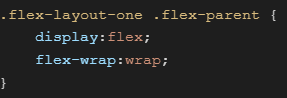
My previous code
And this is the new code with changes:
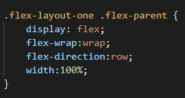
My new and updated code
And this is how it helped:
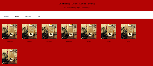
How the page looks with the new and updated code
The images are spread evenly across the page but there is now some space on the right side. Another positive is that they are responsive and line up well when the screen size is reduced:
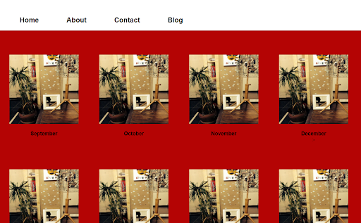
The images are wrapping as the page width is reduced
Images in two columns as the page width is reduced further
But unfortunately, I still get the menu links wrapping when the screen is reduced and the images are not centred which leaves that space down the right side again:
The menu links are not wrapping like the images
I added a media query to the navbar with a @media (max-width:800px) to the nav selector in the stylesheet which only took away the white nav background at 800px and the menu links wrapped again. The navbar’s white background appeared again when the screen was larger than 800px.
I added another media query from W3Schools and this time the nav links go into a single column below the white navbar but the white background doesn’t follow.
I added another media query:
I attempt another media query
And this time I got this:
The page is looking responsive but the image column is left of centre
The navigation is condensing up nicely as I narrowed my screen as much as I could. It looks neat, albeit a bit left sided with the image column. I am wondering whether my code is correct and whether I can claim success here?
Next it was onto the links problem. Last night I tried putting the link to other pages in various places and even put a < link > in the < head > tag where the < meta > tag and stylesheet go but that didn’t work. I just couldn’t remember how I did it so easily last time.
Anyway, I pushed on and right clicked the file I wanted within a file titled ‘blog’ in my VS Code menu and finally- some progress.
I managed to find the right location to place the link and it took me to the page with the basic < li > of week 1-4 but with one issue. The image doesn’t load and my weekly links have moved left slightly:
An unloaded image and the week links below
I had a go at sorting out the image by changing the path but still nothing and I am still unsure why the links are uncentred now. I am thinking that I may have had a play with it at some point and mucked it up. Anyway, I am happy that it is still saved and I'm happy that I've made some progress. I'm still really enjoying myself and this experience, along with all the challenges and the problem solving.
I am realising that my CSS lessons and undertaken tasks on FCC or W3Schools is great when those tasks are isolated and on their own, but in the real world, the code from these tasks is sharing the space on a page with the code from other sections and now that becomes a different story.
I have enjoyed the last couple of days despite feeling like I didn't get anywhere yesterday, but that isn't true. I was always getting somewhere and by struggling and going down dead ends, I’m getting closer to something. It’s all a bit hit-and-miss and trail and error at the moment but that’s okay. I'm just finding my feet and I need to spend time researching these problems to overcome them and to know what not to do.
Feel free to point out where I am going wrong on my Instagram. Can any who is more experienced please tell me whether my troubles are normal and are usually encountered when learning this stuff, or whether I am making a mountain out of a molehill?
Day total: 1 hour 40 minutes
Wednesday 2nd February 2022 /
Not enough time
I began with the usual warm up of typing out the blog code. Next, I turned my attention to the links to the other pages which are not working. I also attempted to fix the image which still doesn’t appear and I don't know why.
I did google the issue a while ago but that didn’t throw up any results. I will have to try googling it again but for now, I will try everything in my CSS arsenal to see if any of that works.
I was really determined to start adding the text from the blog entries today but I have to delay that as I was needed else where. I’m so eager to get get this project up and running but the last two weeks have been difficult.
I am sure things will settle down and I will get some time. All I can do is keep things ticking over and try not to forget stuff.
Day total: 0 hours 44 minutes
Thursday 3rd February 2022 * /
An excellent day of study
While at work I was feeling that I am again a little bit directionless and wandering aimlessly. The last few weeks have been hectic and I’ve lost some focus and momentum with all the distractions.
I know I have been on the blog for a while but I have felt that I haven’t been moving forward. It also dawned on me that I haven’t learnt any new skills lately.
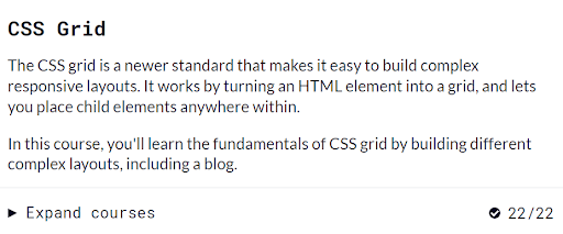
I thought that when I finish work today, I will hit the FCC and the grid section. I have completed a third of the exercises but I need to continue improving.
I was reading recently that grid and flexbox were so useful for websites and it was wise to become good at them. So, I was going to make this my next skill to master.
I went onto the FCC site and went straight to the grid section. Because I haven’t fully understood grid, I decided to start at the very beginning and do all the exercises again:
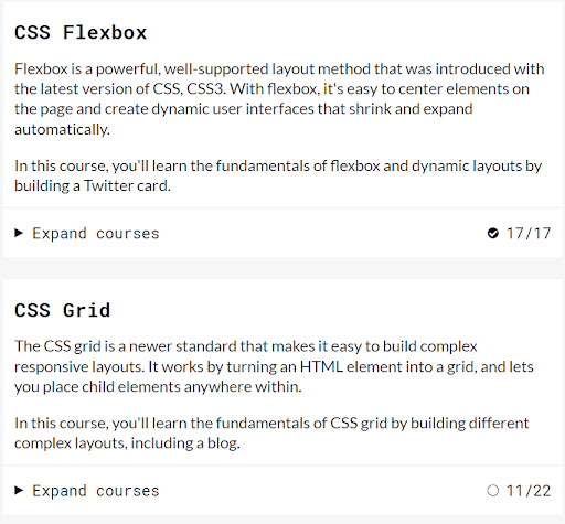
The CSS flexbox and grid section on the Free Code Camp site
Going through it started to make more sense to me. All the experiences I’ve been gaining may be leading to something. I think the penny might be dropping and I am beginning to understand the concepts. Let’s hope so.
The information made more sense this time around rather than it did the first or second time of studying. I got part way through the grid and then decided to switch to focus on the flexbox instead.
I googled if flexbox was useful in building websites and I found this guy called Saiharsha Balasubramaniamand and his article titled, 'create layouts for websites using CSS flexbox'
which explains things nicely and has an awesome looking example:
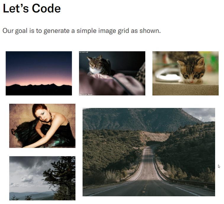
A simple image grid
I returned to Saiharsha Balasubramaniamand and his article titled, 'create layouts for websites using CSS flexbox'
later, but what I did do is open my VS Code and while doing the flexbox section on the FCC, I used two of my images on VS Code to see if I could manipulate them with the methods from the exercises.
It was good. I spent a long time playing with things and trying all the properties on my images. I uploaded ten in total to my browser to see the effects.
I then returned to 'create layouts for websites using CSS flexbox'
and used the FCC to make a hybred version.
The concept of giving the parent flex commands and the children would follow, seemed clearer to me now. I did understand it before but I didn't really get it.
While building my blog, I wasn’t too sure where to put the properties at times. For example, do I give it to the parent or to the child? If it didn’t work in one, I would try it in the other.
Today made things clearer. The irony is that I find the FCC explanations difficult to follow and unclear at times but today, the FCC lessons really helped me understand.
As I was winging it and in full flow, I decided to keep it going and use my skills to go ahead and build a site. I had the images in the parent #container and I went from there.
I was so amazed how easily and clearly I was able to execute my ideas. I added the header and then the menu which happened to appear on the other side of the
< h1 > and < h2 > titles rather than where they usually do.
I knew that things appeared in different areas and with my knowledge, I was able to move them step by step into position with some gentle directions.
I breezed through it without the need to refer to any guides or my library of saved code. I knew what was needed and I was able to do it. It was a great feeling.
It seems that with flexbox, I had learnt a useful second method to making a webpage.
That is where it all ended. I didn’t get the images correctly positioned. I continued by adding properties to the parent and if that didn’t work then I added them to the children. Unfortunately, I didn’t get any further as I was unable to position things how I wanted them.
I read a bit more about grid and flexbox on a site called LogRocket. It explains when to use them and it's really useful little image grid which goes some way to helping me complete my mission.
Tomorrow I will return to grid and crack on with that. I’m feeling confident and slightly more competent at this moment. I really feel I am getting somewhere and I’m on the cusp of something. Not to mention that I’m still enjoying it immensely.
Day total: 2 hours 22 minutes
Friday 4th February 2022 * /
I'm ready to be potty trained
I began studying later than I had intended and then when I got started, I was up and down like a yo-yo. I still managed to get stuck into the grid section on FCC:
Free Code Camp CSS grid section
Took the same approach as yesterday and I started right back at the beginning of the section and the first exercise. I opened up VS Code
and my browser and worked through the section.
I didn’t get the chance to work through all of the exercises and I wasn’t able to add any images to see how I can apply what I learned to real images. I will do that tomorrow.
I am hoping to mess around all weekend with the grid and flexbox to see what I can do. I have a list of things I want to see if it can help with. Things such as:
- my website building skills
- website layout
- website appearence
I am really looking forward to learning more about grid and flexbox and I hope to get a better understanding of the two. As I mentioned yesterday, I’m gaining more experience all the time and with that comes the feeling of being ready to digest the concepts and the ability to understand them better.
My ability to look at situations and decide what the best course of action as well as the best method of achieving that goal is improving. I’ve needed more experience and time for me to be able to grasp things and their use.
An example of this is toilet training my son. No matter how many times he was introduced to the potty - if he wasn’t ready, he wasn't ready. If he wasn’t able to grasp the concept of all the parts, then no matter how many times we went through motions, it was unsuccessful. The same applies to me at this particular time. We have to be ready and with that readiness comes the ability to understand the concept and all the involved parts that can be put together to form one smooth action.
In other words- I’m ready to be toilet trained.
Day total: 1 hour 07 minutes
Saturday 5th February 2022 * /
Not quite there
Yesterday I was all enthusiastic and ready to hit the grid and practise all day. Today, it was a different story. That enthusiasm was replaced with unenthusiasm.
When I got home, I was unable to have any study time and it’s been like that for over a month now.
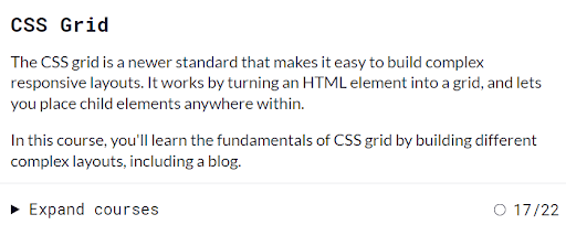
Finally, I was able to have some study time and I immediately got stuck into the grid section on FCC
and complete it:
My completed Free Code Camp CSS grid course
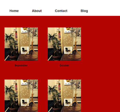
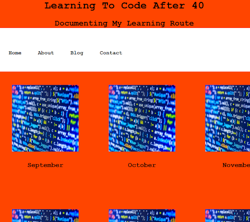
Using the code from the first few exercises, I tried to arrange my images in the order and position I wanted. I couldn’t believe it - I was successful to some extent.
Once I had the images in their container, I chose to arrange them in three rows at first. I then followed that by arranging them in four rows. Finally, I placed the name of the month underneath the images and added a navbar and a header.
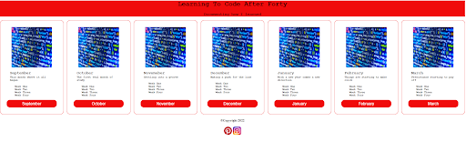
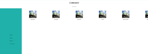
All looked good until I tested it for responsiveness and I found out that it wasn’t quite right:
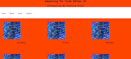
My page has columns of images which are uncentred at full screen
The page is not responsive and the images begin to dissappear as the screen narrows
So, I have an issue. Both screen sizes have some positives and some negatives. On the small screen the text is centred under the image but the images don't wrap and so they begin to disappear as the screen narrows. On the full screen the images were in an acceptable place, albeit slightly to the left which leaves the text looking out of place to the right of the images when in actual fact, I think the text is in the correct place but the images have moved left.
I messed around a bit longer to see if I could improve things with my magic touch. I added a media query which didn’t work and I haven’t got a clue why.
I added a display:flex; and a flex-wrap:wrap; to the image class but that didn’t work either. I decided to call it a night then. I am tired and pushing on would be wasted time as I am sure I will forget what I did by the next day.
Actually, I couldn’t leave it there and I didn’t leave it there. After a short break
I undertook some research on Youtube about using flexbox and grid for image layout ideas for a website as I was determined to not let this beat me.
I found a few helpful vids. One on a channel called 'Layout Land' and another on a channel called 'SyntaxByte' and titled,
'flexbox images responsive grid gallery tutorial'.
Both channels were really useful. I began with using the tips from the SyntaxByte to try and make my page responsive. One thing I found out from Layout Land which is super useful is that Jen Simmons said that it is possible to just use grid or flexbox for only one section of your site and use other methods for other sections.
By this time it was late and I was tired. I did wake up the next day with a vague idea what I had done. I altered a lot of code and things didn’t go perfectly, so what I will do is stick to the FCC
code for now and get the basics right.
Day total: 1 hour 11 minutes
Sunday 6th February 2022 * /
A helping hand
My first port of call today was the FCC grid. I had erased all the code and changes from yesterday and loaded all my images, ready for manipulation.
I worked through some of the exercises on the course and got bored. The videos I watched last night seemed to do things simpler. I am not a fan of watching and learning from videos as I much prefer to see things written on a page like CodePen, W3Schools and HTML.com.
Last night I watched a video by Jen Simmons on the Youtube channel 'Layout Land' and it had a link to a website of hers called 'THE EXPERIMENTAL LAYOUT LAB
OF JEN SIMMONS'.
It isn’t the first time I have watched a Jen Simmons video but it was the first time I followed a link to a website of hers. It had some more vids with her conference talks and as you scroll down, it had examples of her work available on her Codepen.
This example was on the Youtube video I watched last night:
An example of nesting flexbox and grid by jen simmons
It looked awesome and so I followed the link to her CodePen.
As well as looking awesome, it looked like it had some great things to learn and by looking at her code, I think I could learn a lot.
I am beginning to follow a few developers who have interesting code that I can learn from on CodePen and it’s becoming my new favourite place to learn and discover new ideas and how to do them.
I set to work on building and adapting the page. I changed the classes, text and swapped the images as I went through it. Best of all, it had an awesome and clear method for a responsive webpage that I could learn from.
Jen Simmons code
This was exactly what I had been covering and trying to learn on the FCC earlier today and last night.
Below is what I arrived at:
My page after the Jen Simmon's lesson
Responsive and wrapping to four columns
Responsive and wrapping to two columns
Two columns in yellow
I really love this card design and I’ve just jumped forward in my progress . I really want to say a big thanks to Jen Simmons for making your code available for all to view. I really learned a lot from this example and it is really clear and straightforward.
Day total: 1 hour 26 minutes
Monday 7th February 2022 *
Next problem to overcome
Yesterday went so well and I felt good at how far I got. While at work I was planning what I am going to do when I return and get to sit at the laptop.
I should have remembered my good day/bad day pattern from before. As I sat down and typed out the code from yesterday for practise, I was brought back down to earth.
I spent time trying to remember the CSS mainly as I don't have too much trouble with the HTML section. In HTML I am able to lay everything out for my basic blog/homepage and add the links.
The CSS is what I still need to work on. I played around with the CSS trying to add nice colours and making it less harsh and softer on the eye.
I realised at some point that I haven’t added a navbar. So, I set about adding one and this is where I was brought back down from my cloud on high.
While adding the navbar, I realised that I couldn’t do it the usual way because it affects the < li > and < ul > tags in the cards which are used for the week one, week two code:
Coding the navbar links affected the other links in the cards
I gave all the links and nav class names but I still couldn’t get the navbar links to go inline-block:
I couldn't get the nav links inline
It’s another thing that goes on the list of things which I need to conquer and learn. It is also a reality check of how far I still have to go.
Later in the evening, I spend some time reading about web hosting and what it entails. It’s time to start reading about this stuff and educating myself as I’m going to need to be able to do this soon if I’m ever going to make the site go live.
Day total:1 hour 50 minutes
Tuesday 8th February 2022 * /
Blog time
Last night I had another go at horizontally lining up the navbar links and as you can see from the images below I was successful. I made the breakthrough by watching a few vids and by reading some more stuff. Then it was just a case of having a go, and seeing if it worked.
Anyway, I left it at that. I didn’t time myself or include this in the study time.
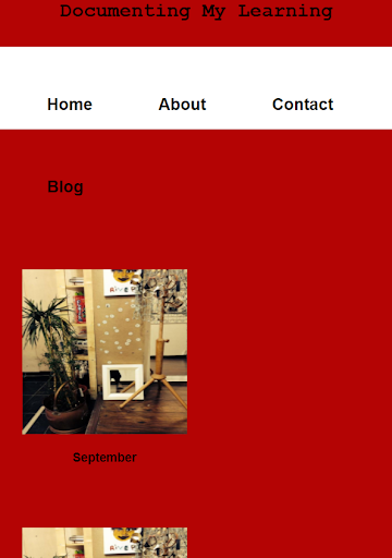
It was all about the blog site today. I spent all the time improving it and getting it ready. I messed around with it, I changed a few of the colours and removed some links:
The nav links, images and text on the webpage are all lined up corectly
I want to add a link to the < button >, but to do that, I must learn it first. First port of call was stack overflow but the answers all seemed too advanced for me.
Next port of call was old faithful, W3Schools and it appears to be JavaScript time:
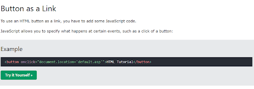
A W3Shools exercise on how to use a button as a link
I tried and tried but I couldn’t get it working.
The next site I used was was called 'Programming Head'. I had to scroll down the page but I found what I was looking for:
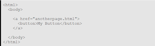
Some code for a button
And it did have the desired effect of adding a link to the button but unfortunately it also had the undesired effect of changing the style of the button to this:
The code changed the style of the button
I then took a gamble and rearranged it like this:
The code I wrote to try and change the style of the button
And it returned this style of button with a working link but now I had a button which was different:
I got the link working but the button still wasn't right
I was happy the link worked but I needed to sort out the button. I noticed a few too many < a > tags in the code. I removed what I thought were the weirdly positioned ones and that corrected the button but left the text out of position.
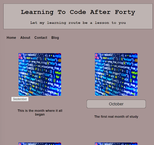
The September and October text, which were the only two months with links had moved their position slightly within the button.
The button returned to normal but the text needs centring in the button
The link worked on one of the month’s < button > but when I added it to all of the months, it didn’t work on any of them- it was back to the drawing board.
I spent ages scratching my head and googling it to figure it out. Finally, I got this and it worked on all the links to my other pages:
I managed to code a button with working link
I don't know if I'm doing things the right way. I seem to hobble along and try different ways until I find the one that works. As the links work, my only issue now is that the month names are out of position which I can't seem to fix:
Uncentred text in the button
Later in the day after I hung up the study cap. I went ahead and bought the domain name learningcodeafterforty.com and set up a gmail and an Instagram account with the same name. I continued reading about hosting in order to learn more.
Day total: 1 hour 57 minutes
Wednesday 9th February 2022 /
More questions than answers
I took the decision to take it easy today as I've had a busy day and felt a bit drained. I didn’t have the hunger to keep up the pace but I also didn't want to miss any study and I was determined to try and resolve a few of the issues I have.
I played around with the blog and I made a few tweaks here and there. I want the blog to look nice which is difficult as I am definitely not an expert on design or colour pallets. It should also be obvious that I am neither an expert on website design or website building.
As I set up another page linking from the home page months, I had many questions running around in my head.
My first question is related to the CSS on the new pages for the months. For example, the month of September, do I have the HTML and CSS on the same page by placing the CSS between the < style > tags or do I follow the rules of the homepage and have the HTML on the page and then add a link to the CSS stylesheet in the < head > tags?
Second question is how do I get to change the text colour on a tag? I am having some difficulty with it. This example below shows what I would like to do:
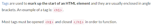
Tags highlighted in red in the text
The word ‘Tags’ which is in blue is a link. The < h1 > and < /h1 > are in red. Now I cannot make my tags appear red on the text in the browser. I am writing tags on the blog articles and I just want the tags in the text to appear on the screen in red just as the above example.
I think the issue arises because they are tags and then to highlight them or change their colour, I think I need to add another tag, class or id and place them either side of it- something like this:
< span class="hightlight-word-red-color" >< h1 >< /span >
< h1 >< /p >
< a >
I am not sure what is happening but I get the impression that by having tags with <> pointy brackets in the text, makes the browser read them as code and so it wants to add it as code rather than text in the article.
Day total: 0 hours 30 minutes
Thursday 10th February * /
Feel good, refreshed and ready to go today
Last night a suggestion came up on my Youtube titled ‘CSS Layout: Flexbox & Grid Basics’
On a channel called LearnWebCode.
The guy’s name is Brad as in the description is a link to Brad’s CodePen and this is what the page looks like:
Brad/ LearnWebCdoe's CodePen
A really useful vid and a simple good looking design. I found him to be really great at describing what he is doing and what he wants to do in clear step by step way.
Well, I enjoyed his video and explanations so much that I went to CodePen and copied the code into my VS Code and displayed it on my browser.
I used my time to type out the code and then start changing and adapting the page for myself. It looks classier than the other site I’ve been using, which was really a purchasing site, even though I thought it was clear in its navigation and appearance.
After tinkering around with the site, this is what I came up with:
How the page looks after I have tinkered with it
How the page looks in a narrowed two column view
Day total: 1 hour 46 minutes
Friday 11th February 2022 * /
Need a gap filler
I had a few things planned for when I had finished work and I was planted in from of the laptop. Firstly, I wanted to practise the new webpage on Brad’s CodePen. Secondly, I wanted to return to my wife’s website and see if I can build it using grid.
I began with a warm up of typing out Brad’s CodePen code while looking at closely each component and how they work within the bigger picture as I made my way through the code.
As I continue through different people’s code, I still find myself having to look up details of their code as I still have a massive gap in understanding of many aspects of the code needed to build a website and I feel I should know most of this stuff by now and be able to retain it in my memory.
I also feel that I shouldn't be too hard on myself as I have only been doing this for four plus months and I shouldn’t expect to know it all in a few months. I can layout the HTML from memory with hardly any issues but it is the tricky bit is the CSS and I still lack many of the fine details.
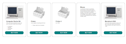
I thought I would have an attempt at my wife’s site and see how far I get. The HTML was not a problem but the sidenav which was located down the left hand side and the rest of the page's contents was a different story.
The header and the footer were pretty straight forward and I managed them without any issues. The sidenav took a bit of work and it was a bit hit and miss but I managed it.
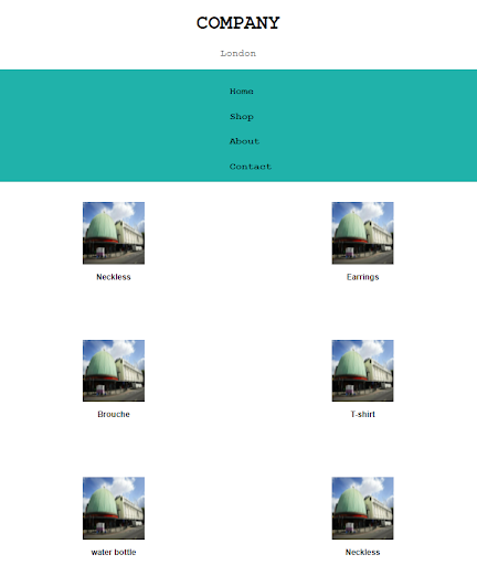
The biggest problem today was the main content and the image gallery. I got mixed up when I tried to use grid. I only managed a two column layout that wasn’t responsive and the images were extremely close to the sidenav and that left a large white unused area down the right hand side:
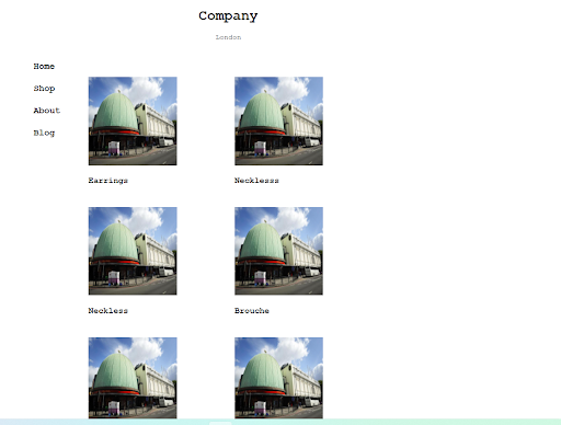
My two column layout with a sidenav
I really want to get the images to fit in three columns and also be responsive. I desperately hope to get better at flexbox and grid soon.
Some advice I’ve heard many times over the past few months is that learners should play around with stuff as much as possible in order to get a feel for it and to see what works and what doesn't. Well, I am playing and I hope ‘the seeing what works’ comes along soon.
Day total: 2 hours 07 minutes
Saturday 12th February 2022 /
New plans and a new attempt
I was in need of rest today and I said to myself that I was not going to study but instead take the opportunity to rest and recharge.
Well, that didn’t happen. Last night I watched a few vids about flexbox and grid layouts and I really wanted to try them out. I decided to focus on one of them and make as much of an attempt to get my head around that one and then see if I can match it to any of my projects.
The vid was titled ‘How to Create a CSS Flexbox Sidebar and Content Layout - Responsive Web Design Tutorial’ by Front End Beginners .
I jumped striaght into it and put in a shift and memorised it and I found it was good. I didn’t spend long enough on it to start adapting it but by the end, my layout didn’t look the same as Front End Beginners.
This is Front End Beginners’s side bar and contents:
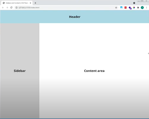
Front End Beginners' sidebar and content
And this was mine:
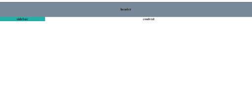
My attempt at a sidebar and content
lots of white space but I couldn’t leave it at that. I went back and found what the issue was. It was a lack of space either side of the minus sign:
I forgot to leave a space either side of the minus sign on this code
Front End Beginners uses media queries with his flexbox. I’m guessing here, by using grid, it eliminates the need to use media queries. Could someone please let me know if I am correct on this.
Now that I found the issue, I carried on and added some bits. Again I really want to understand and get my head around the flexbox and grid.
I seemed to get it and then I didn't. I understand the items nesting in the container and then it seems to get too complicated. Either that, or what I try and know doesn’t work. Maybe I can’t see the wood for the trees?
I had a mess around and it started to get a bit messy. I was losing control of the bit on the screen. I am definately improving my ability at placing stuff in the sections and now I all need to improve the fine tuning and being able to complete things. An example of this is the nav list which I will have to figure out.
Day total: 1 hour 10 minutes
Sunday 13th February 2022 * /
Grid issues
Spent time today messing around with the same flex container as yesterday. Got things in shape with all the areas nicely defined and the heading is nicely centred:
My webpage is looking better
And a bonus is that it’s responsive too:
My webspage is even responsive
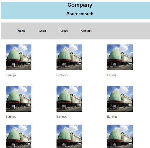
Now I have a working model, I’m going to return to my wife's site and see if I can incorporate grid on her website as it is quite blocky in that there are many images so I think grid should work.
Again there were a few surprises and it wasn’t all plain sailing. The issues are with some of the images again and getting them to behave as I want. I’m still using the same media queries from yesterday so I went back into my library of code and tried using that with this project.
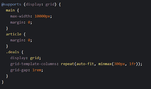
I used grid on the image container and a grid-template-columns: repeat(auto-fit, minmax(300px, 1fr)); and I stopped the media queries but things are behaving differently. I think some things may be clashing and the sidenav has altered slightly.
I’m calling it a night and those issues can wait until tomorrow.
Day total: 1 hour 21 minutes
Monday 14th February 2022 *
A new grid method
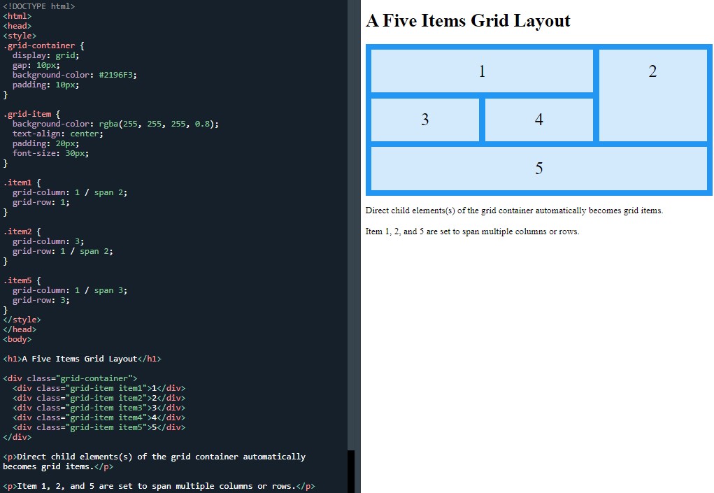
I decided to take an easy approach today by just copying a grid vid I saw on Youtube a few days ago. The reason being was that this vid uses multiple images in various sizes in a layout that uses columns and rows. I thought that by using
grid-column: 2 / 4; and grid-row: 1 / 3;, it would be good practise for me to try this method and perhaps, it may well suit my needs for the site.
The vid is titled ‘ CSS Grid| Real world examples'' by Sweetdev and he has a few ideas I like and a different ways of executing them.
He demonstrated a few new ways of creating a nice looking image gallery. I watched it through and it’s not responsive which means that I'd have to add that part.
Day total: 0 hours 26 minutes
Tuesday 15th February 2022 * /
Finally - a small win
Not a fantastically productive day at the beginning. I spent the early part of my time trying things that didn’t work but then I was pleasantly surprised when it all came together.
Yesterday whilst copying the Sweetdev’s CSS grid vid, my attempt had a few differences compared to his video. This happened again today. I’m not sure if I was doing something wrong.
I got through most of the vid and then decided to just mess around and practise stuff to see what works and what I can do.
I had the display:grid; set to three columns but only the top row of three boxes were the height I intended.The rest appeared squashed.
They were the right width but only a fraction of the height. I don’t know why this happened. I then decided to try and blend the simple sidebar and main with this grid to see what happens.
Again, I got a similar outcome when I added the two:
My attempt at a grid
My aim is to discover a clean and easy method of having a header, sidebar and grid for the main contents. My dilemma is that I am unsure of the best way to do this so I’m figuring it out as I go along.
I don’t know whether I need to have a separate header, sidebar and main content or whether I should go full grid similar to this example in Mozilla:
An example grid from Mozilla
I’m wanting to stretch the header across all the top cells using grid-row: 1 / 3;, then add a logo and title inside it.
I googled this question and it took a little bit of reading and a few sites, but with a stroke of luck, Smashing Magazine answered my call with an article called ’CSS Grid Gotchas And Stumbling Blocks.
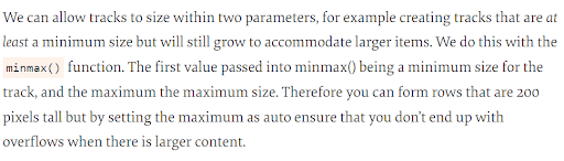
An extract from Smashing Magazine
I got straight on to it and tested it out and it worked. Thanks Smashing Magazine:
The minmax tip from smashing magazine that worked
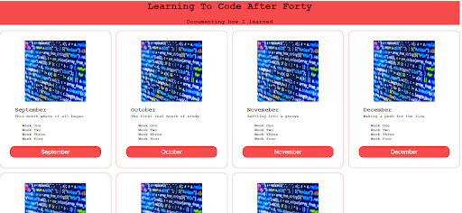
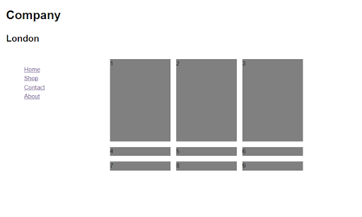
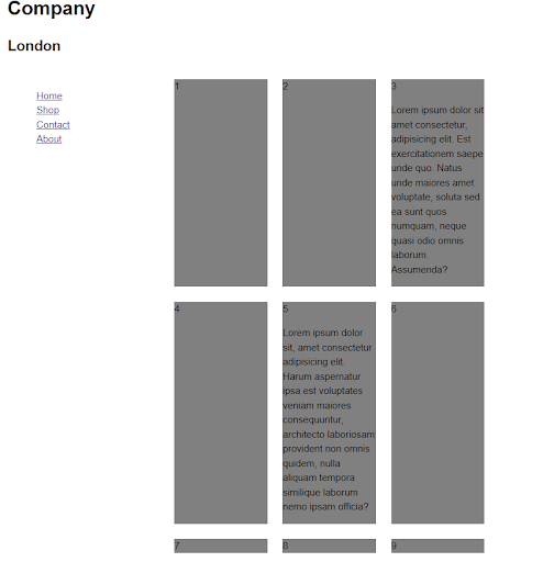
I pushed on and added some images and got this:
I added images to the grid gallery
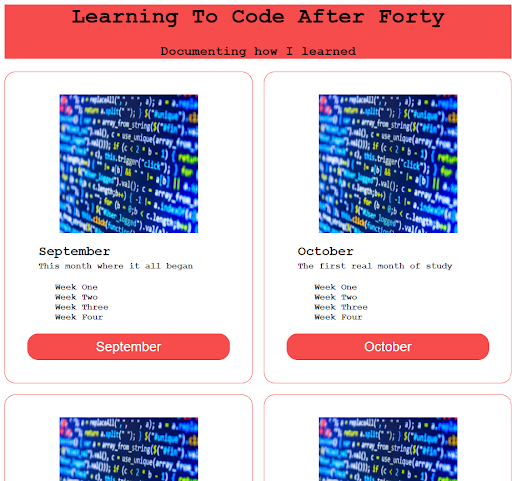
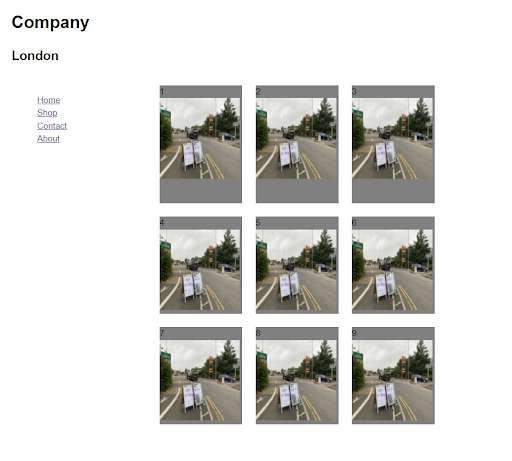
I added text for each item and this is beginning to look promising:
Next I added text to describe each item
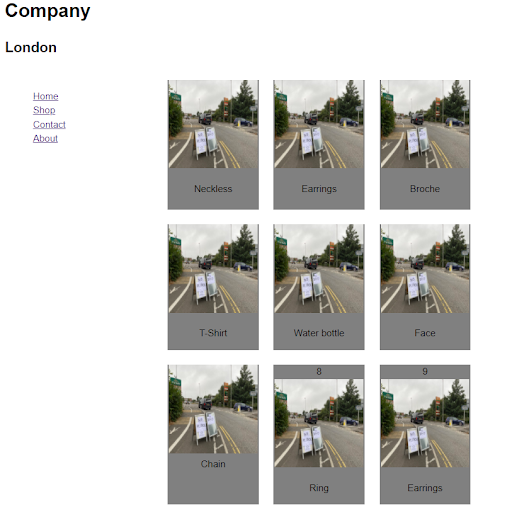
After adding the text, I styled the font and removed the numbers and the background colour:
My image gallery, side nav and header
I’ve done it. I have been grinding away on this for ages and battling to get all three sections (header, side navbar and main content) layed out in this arrangement.
I am happy and relieved now and I am really hoping that this breakthrough will take me forward. I feel that I’ve won this small battle but I’ve yet to win the war and I’ve got a long way to go yet. I’m going to enjoy this little success as the webpage looks slightly better than previous attempts with the added bonus that the code is simpler and the process easier with grid. Thanks grid.
Day total: 1 hour 26 minutes
Wednesday 16th February 2022 * /
It was just one of those days
Usually, after a good day of breakthroughs and success, comes a day of difficulty and pain. Today was the latter, if you hadn't guessed.
I spent the first big chunk of the session learning and retyping my successful code from yesterday. This was followed by me attempting to use some of it to make a site that has a top navbar rather than a sidebar. I kept everything else the same with grid to display the images.
I got the header and the top nav in place but I couldn’t get the images to behave like they did yesterday. I used the code from yesterday but it didn’t work.
I tried many different things including looking through previous projects but to no avail. I’m thinking I should scrap it all together and start again.
I erased everything apart from the image gallery which I kept. I then headed over to W3Schools to check out a grid lesson to help me solve the problem. I couldn’t find the answer and I didn’t solve the problem. I have to admit that it was just one of those days.
Day total: 2 hours 03 minutes
Thursday 17th February 2022 * /
Am I cut out for this?
I do not get things sometimes and that leads to a rethink.
Last night I just couldn’t make things work. Earlier I looked on Wes (specificity) Bos’ website and his free course on grid.
I sat at the laptop and signed up. I was just about to play the intro and then I felt this strong need to return to last night's code and have one more crack at it to see if I could get it right before I return to the internet for help.
Within ten minutes I had a grid layout topped with a header and nav:
My next attempt at a topnav with header and content section
Admittedly, it isn’t perfect or finished but I did manage to get this far.
Fast forward a few hours and I am writing this and I am trying to retrace my steps and figure out what I did. I know I changed some class names and I began with the images and grid before adding the nav and header.
I did all this from memory without any issues or the need to look stuff up. Later I spent some time while at work wondering whether I am cut out for this.
I thought that after entering my fifth month of learning, I should know more than I do now and I should have the ability to do grid and flexbox with ease.
But am I being too hard on myself?
Days like today prove that I can do the basic stuff well and from memory. I can build a simple page now in ten minutes from memory. That feels good and I know that I am learning and capable of learning this stuff but at a slower rate than I expected.
So what is my problem?
In January, I relieved some pressure on myself by easing back on the competitive study and the desire to complete the learning at record speed.
Since then I’ve been trying to think of coding as a hobby and if that hobby happens to turn into a paying gig then that would be awesome.
After my small success with the above page layout, I went back to Wes Bos’ site and grid course and finally played the intro and got stuck into the first three of 22 lessons. They were the ‘welcome’, ‘the set up’ and the ‘grid fundamentals’.
I didn’t download or import any of the bits he was using, instead I went straight for the lesson. I copied out the code on my editor as he was going through and explaining things. Then after the fundamental lesson, I took the code and played around with it.
He used the grid-template-columns and grid-template-rows for the layout. A few days ago, I copied a video from Sweetdev’s lesson where he used grid to layout a series of images with different widths and heights that spanned columns and rows.
Suddenly, I had an impulsive urge to build that. I went back to W3Schools and grabbed their lesson on grid:
W3Schools' CSS grid layout
This exercise explains the spanning of columns and rows. I am sure Wes Bos will be going into this at some point but I was impatient and wanted an immediate fix in order to practise something I have, up until now, been unsuccessful at achieving.
I can’t believe it but my plan worked and I was able to mess around and put images in the boxes. I was able to get the boxes to span over multiple columns and rows or tracks as Wes Bos calls them.
I needed to add background colours to all the grid-items so I knew which one was which as I was getting a little confused.
This is a lot trickier than I thought it would be. The images were in the boxes and I set a width and height of 150px which meant that they did not fit the whole area of the box. I will now have to learn the best way to display the images in a box, either by stretching them out or making the box smaller in order to contain the image.
I am edging forward and getting over hurdles even though it doesn't feel like it at times. I had a serious thought at work today about the direction I’m taking with regards to what skills I want to be good at. Having had a great afternoon along with an awesome two out of three days, has given me some belief.
I built my wife’s site in stages and I had to learn each aspect of the site and bring it together on one page at the end. I’ve had to adapt after realising that I needed to go back and learn grid in order to build it in a simpler and more efficient way.
The last site for her used grid and so I can say that I learned and accomplished and overcame a problem. I looked at what I wanted to achieve and found the best way of achieving it. It’s not been easy and I’ve had many issues setting up the layout using grid but I have started to see progress.
A constant problem I have is that as an individual stand alone task, I can type the grid code out and get it working without too much sweat. The problems arise when I begin to add stuff and from then onwards, everything seems to clash and doesn’t work.
I am not experienced and knowledgeable enough to know what is wrong. Am I making things too complicated; am I just plainly making newbie mistakes; or am I trying to be too perfect and learn everything before I start building things?
Perhaps I should take a different approach. Instead of learning everything, I should instead build more stuff and then when I get to a problem, learn how to resolve it and that way learn as I go.
Day total: 1 hour 21 minutes
Friday 18th February 2022 * /
Today was an enjoyable day
I continued on from yesterday by heading straight back to practise the grid and the spanning over the tracks to other columns and rows. I am so determined to get this.
I would also like to push on and overcoming the grid issue would really help me to make progress with the blog. There are also many other skills I want to learn like ecommerce, JavaScript and adding a comments section to a website.
Not only is my inability to learn grid a significant reason for the blog not being ready but another reason that is holding up the blog is that I can’t decide on a design. I’m encountering things that I never considered before I started learning this stuff. I should now devote some time to learning a bit about design.
Someone suggested to me a website that I should consider learning from. They speak highly of this site and have used it to help them learn coding. I’ve have been reluctant to have a peak at it as I am already neck-deep in lessons and resources.
Turns out this is a free bootcamp and that has put me off. I’m not put off by the learning of new stuff but by the stories of intense learning in a short period of time. At the moment, I am employed and my life is really too full already to consider adding more pressure to it.
There’s a chance that this could be a good move and I could really benefit from structured lesson and syllabus in a learning environment but hearing the word ‘bootcamp’ conjures up images of font-end and back-end and many languages and I think that is too much for me and way above my league at present.
I know it’s free but I also know that I am content with my commitments at the moment and doing a bit of learning in my spare time. I am going ‘slowly and surely wins the race’ kind of pace with my own studies. I’ve set my first goal of learning to build websites and then when that is achieved, I will consider my next move.
This is as far as I got last night:
My simple grid layout with images
I went back to the same W3Schools’ grid layout lesson as yesterday so I could practise playing around with the boxes.
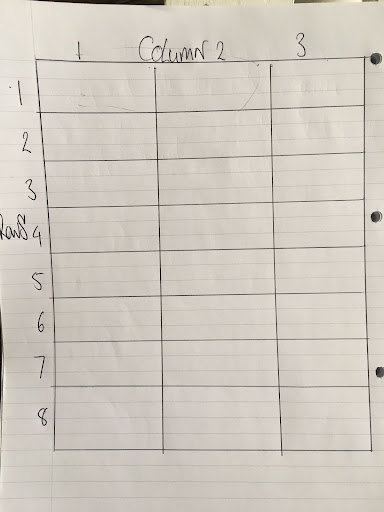
To understand the column and row number a bit better, I drew a grid on paper. It didn’t really help too much and I was able to do the columns and rows without referring to the drawn grid:
My drawing of a grid with numbered columns and rows
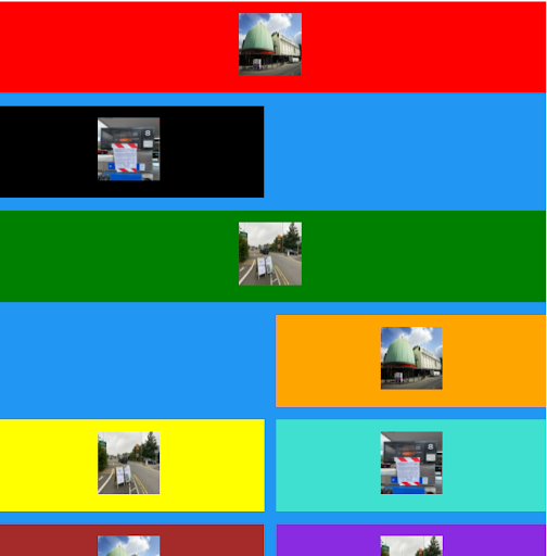
I carried on and added bits to it. The extreme colours I added were there so I could identify the boxes more easily in the grid and to make changes to the CSS.
Orignially, the colours were there as a tool to help identify the boxes but I am warming to the them and the layout even though they are garish and partly an experiment. I added a clearfix hack which meant I had to return to a W3Schools lesson to look it up, along with floating the image left or right:
My garish webpage
Another view of my garish webpage
My goal is to tidy it up over the weekend and to change a few things like the nav links which are the ones I use on my wife’s site. I naturally added them without thinking about it.
Day total: 1 hour 15 minutes
Saturday 19th February 2022 * /
This day started on a downer and then ended on an upper.
I warmed up by typing the code to the garishly coloured page from yesterday. I like it in an odd way and I wanted to see where I could go with it.
I didn’t feel too energised when typing it out and it was a grind if I’m being honest. When completed, it had loads of bugs that I had difficulty finding. I decided to walk away and give myself a break for the rest of the day.
Well, that lasted a few hours and then I was back and determined. Earlier I showed my wife the design and asked her opinion. She said that it was too loud and bright which were my thoughts aswell.
I decided to look at a few blog layouts to learn something about the style and colours. I want something that makes my page colours more subtle and look a bit more sophisticated. I took a few screenshots for reference and set about adding and taking away a few things.
The reason for the colour in the first place was as a tool to identify each grid-item in the CSS. Instead, I removed the background colour and I just kept a coloured border for each one and set to work moving them around.
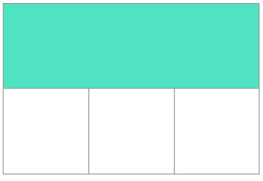
To complicate things a bit more, I added a section at the start of the container which fits on the page between the navbar and the bordered images.
This section is intended to be an intro or something like a small piece of text. This means that everything under it had to shift down and I had to alter all the grid columns and rows. This was a little tricky but enjoyable.
I like the mash up of the odd shaped boxes and it is fun fitting them together. Some of the other blogs have cards and they all look plain.
I don’t know if I am making a mistake by going against the grain but I’d like to have something a bit more interesting and in the meantime, I’m hopefully getting to grips with the grid and the container, which is all good practise and vital experience at the same time.
Day total: 2 hours 17 minutes
Sunday 20th February 2022 /
A simple day today- almost a rest day
It’s my intention to take it easy today. I only have one day off from work this week and this is it.
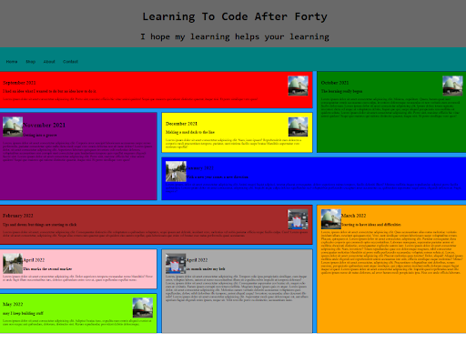
I set the goal of just wanting to tidy up the home page and then make a start on editing the blog in preparation for the transferring of it to the VS Code. I think I have found the design for the home page which I am happy about.
I could have made a start on designing the other pages but I chose not to. I still do not know if those other pages should have both a separate HTML and a CSS stylesheet like I am doing with the present homepage or should the HTML and CSS be on the same page for the other pages on the site.
I added two new sections to the grid. They were both the year dates of 2021 and 2022. Again, by adding these two bit, means that everything else had to move down a row or two and some more practise with the grid rows and columns.
This is beginning to get easier and easier the more I do this and I’m enjoying the practise of getting the column and row numbers correct.
Day total: 0 hours and 31 minutes
Monday 21st February 2022 * /
A great day full of awesome experiences. I wish I had started this sooner.
Initially, I thought today would be a grind. I didn’t have that pumped feeling and I didn’t have a plan of what I was going to do but that didn’t matter.
I started by trying to make the blog page responsive. I removed a few things and added a few things and tried a few more things.
Some stuff worked and some stuff didn’t.
The next step was to try and get the blog home page finished. This is where I felt energised and I began to wish that I had started this earlier instead of putting it off.
I should be further ahead than I currently am but I have been delaying the blog and learning for a while. I’ve really been just bobbing up and down for a while in the wilderness.
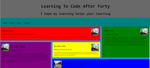
I set up lots of new pages like the 'contact' page, 'about' page and 'home' page and linked them all up. It felt awesome to be growing the site from just a homepage.
I was buzzing as I was getting stuck into the nitty gritty. I’ve realise that a one page brochure website is easy but there is a lot of work to building a multi-page website.
As I’m growing the site, my thinking is shifting somewhat. I’m considering the user and their experiences as they navigate the site. I’m looking at the navigation and view and wondering if it works for the visitor. Working out these problems is new for me and moving past the simple design and coding problems.
Day total: 1 hour 28 minutes
Tuesday 22nd February 2022 * /
Going around in circles
Today was a bit up and down. Today's quest was to put a responsive navbar on the blog. I began by googling the question and found a site where I could add a hamburger menu icon which I thought would be okay but I decided to keep it simple and head back to W3Schools again and see what they have on the subject.
I chose one of theirs but I didn’t use it in the end. Instead, I used the one I found before, except I decided not to keep some of features like the colours and the hover effects. I also kept the menu text but most of all I wanted to keep the media query for its responsiveness.
Once that was done, I went back to the blog and tried linking all the pages together. Yesterday I had the ‘about’ and ‘contact’ pages linked to the 'home' page but those pages were not linked to each other.
This is where the fun began. On the ‘about’ and ‘contact’ pages of code on the VS Code, if I hover over the links to the other pages, up pops a message which says ‘follow link’ in blue text.
When I tap on that link, a message appears that states that VS Code is unable to open the requested page. Then it asks whether you want to create a file.
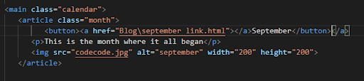
I created loads of new files and pasted the code over but that didn’t work and I still can't link them together. Other issues arose regarding the images which didn’t load along with the links to the months.
Man, I finally sorted out the links issue but I couldn’t sort out the images and why they are not loading.
One positive that I can take out of al this, and that is that I am learning to use the debugging tool on VS Code.
Day total:1 hour 25 minutes
Wednesday 23rd February 2022 * /
Not as much time as I’d liked to have spent on the studies
The issue of the VS Code files continued today. I still don’t know what is happening. Some do not link up and some are now saved on my computer.
I get up really early for work so at 03:20am while eating breakfast, I continued my search for answers as to why the pages on my VS Code are not linking up.
I found one site that suggested that the reason being is because the files have moved and need the relative path or the other path’s route changed in order to be able to link them.
Essentially, the forward and backward slashes are the problem. By changing them to the opposite direction, immediately made them work. That was so odd figuring that out and I was so happy that I continued the same method for the other pages and unfortunately, it didn’t work on them.
After work I opened up the blog and changed the < header > from flex-wrap and put a media query on it. The wrap is okay but the text contents spill out of the border box when the screen is reduced. When I add overflow: none; then it disappears when in mobile phone view.
The media queries I am using works. I now need to reduce the border and I have noticed that when it is in full screen, the title sits at the top of the border box despite having a text-align:center; code on it.
I pressed on with the blog but didn’t time myself despite some of it actually being code writing and the adding of tag links. The site is like a maze now with all the links to all the pages.
I am happy that it is taking shape and I am happy that I have finally started moving forward with it and seeing progress. All the intricacies, the bugs, the links and complexities are all coming out to challenge me. I’m learning a lot.
Let me have issues and difficulties now and learn from it so hopefully I would have overcome many of the way by the time I tackle the next project. I am debating whether to add a 45° tilt to the navbar links now.
I think adding the 45° tilt may be a too much to add at the moment but I will add one soon and see how it looks. I am also wondering whether to add a gradient colour background which I saw the idea demonstrated on Awakening STEM’s Youtube channel the other day.
With the colour gradient on the blog, I’m wondering whether it looks okay or a bit OTT tacky. I don’t want to be one of those people that go over the top on their first project and show off all the little skills they know in one go and on one site, rather than being subtle and using just a few.
While going back over some old lessons in the HTML page, I came across the optimising images for the web which can help reduce web page loading times according to the HTML website. This is something interesting and may be useful as the blog will be littered with images
.
It's crossed my mind that having a mentor could be beneficial. I have a friend of mine who is studying computer science at uni and he has been advising me on a few things recently. I contacted him last week to ask about web hosting and he asked me, “how much storage do I need?”. I couldn’t answer. So many unanswered question. I hope that by pushing on, I will eventually find and answer to them all.
I’m still loving the challenge and the project building. It’s making me feel alive.
Day total: 0 hours and 34 minutes
Thursday 24th February 2022 * /
At the end of the day I was buzzing
Firstly, I have been so worried about losing my code that I decided to make an account and sign into VS Code. I lost my index.html file from VS Code recently but thank goodness I had copied and pasted it to another file on my computer and it was a simple case of copying back into the VS Code.
I just solely worked on the blog today but I had to go back and forth to reread some stuff from months ago on items sure as < em > tag for emphasising text for image captions.
I had plenty of research to do in order to place images and captions in correct positions on the screen and the correct position above and below each other. I didn’t succeed in finding answers to all my questions so it is still a work in progress.
I felt that focusing on the blog and bringing it to life is what I should be doing. I have felt that I am learning so much that it’s a good move attempting the project and also a good move keeping a diary for the contents of the blog.
Whoever said that building stuff is the best way to learn was right. I don’t have any regrets about how I have gone about my learning, but looking back on it, and in hindsight, I think I could have cut a lot of the waffle lessons out and avoided some of the many details of HTML and a CSS until I needed to learn and instead, got stuck into the building project sooner.
It may sound slightly silly but I am enjoying the gritty stuff like the linking of pages together, the spacing out and positioning of items and text, the struggle to understand media queries, the narrowing of the paragraphs as readers do not like long sentences, getting the font size correct - absolutely everything is awesome and an enjoyable learning experience for me.
It is starting to look closer and closer to completion. It is basic and hopefully not too over-the-top and garish in the colours and design. I’m looking forward to working on it more and maybe one day completing it.
Day total: 1 hour 54 minutes
Friday 25th February 2022 * /
A plain day
Nothing really happened today, well, nothing really to write about.
It was a usual day where I put some time in but didn’t get too much in return. I had a tinker with the blog as it still looks as though it isn't quite right and still looks a bit rough around the edges and amateurish.
Some of the < h3 > links to the months are not quite right when the screen size is reduced. Another problem is the three images at the bottom of September’s page are not right either.
I’ve gone with grid but I cannot get them to form a column when the screen size is reduced. Instead, I get a side scroll and from the advice I read somewhere that I should do everything in my power to avoid scrolls.
I corrected all the links to the pages and made sure they worked. I needed to go back and add some more images to the month boxes on the homepage. I don’t know what happened but they had disappeared.
I can not wait for the day when I am enough of an expert to be able to avoid these problems completely because I know what I am doing in the first place. Finally, I narrowed some of the content on the pages as I’ve heard somewhere that long sentences are a no-no on website. There should only be a certain number of words or characters in a sentence and this should dictate how wide the paragraphs will be.
I narrowed the small intro on the homepage which is underneath the navbar and above the monthly content. I tried to place a border around it but that had an unwanted consequence on a few other sections by making them behave in a strange way so I binned that idea.
Day total: 1 hour 03 minutes
Saturday 26th February 2022 * /
Short and some what sweat
Continued from where I left off yesterday determined to make progress. I began by adding a footer with two icons- Instagram and Pinterest. These are the only two social medias that I am going to use.
I’m still having problems with the images and the < h3 > on the homepage links. I’m wondering if it would be okay to put it out into the world in its present form- rough and work in progress, or whether I should be more professional and get everything right before the grand launch?
My opinion at the moment as a complete newbie is that making it go live would help by allowing me to see what it looks like on different screens and then if it needs adjusting, then I can go from there.
I finally succeeded on the September page with the images. The images are a tricky customer as far as I’m concerned. I found out what to do by googling the question to my problem and that led me to checking a few sites, finally settling on Stack Overflow’s suggestion which worked perfectly.
One more issue down and a few more to go. Edging closer everyday.
Day total: 0 hours 49 minutes
Sunday 27th February 2022 /
Squeezed in what I could
I found it really difficult to find some time to sit down and practise. Before I started studying today, I had already decided not to play around with the blog page and to do something else instead.
Our washing machine broke down yesterday so I packed up the dirty laundry and the laptop and headed to the laundrette. While the clothes were washing, I set the laptop up on the machine and managed to cramp in a a few minutes between the washing and drying.
I went back to my wife’s website and practised typing it out and getting familiar with it again, ready to have a play around.
When I got home, I realised I had typed out the old one by mistake. I was hoping to make more progress and learn more about adding ecommerce and more experience with the website. I also have another project where I need an ecommerce site so my wife’s site is the guinea pig.
Day total: 0 hours 32minutes
Monday 28th February 2022 * /
Foot off the gas
I admit that recently, I’ve struggled to keep up the pace of study, so today, I took it a bit easier today. I put in some time but I didn't go too heavy or pressurise myself.
I found my code for the latest version of my wife’s website and typed it out as a warm up and to refamiliarise myself with it again. For some reason I have a scroll bar at the bottom of the page which moves the page over, ever so slightly. I’m pretty sure it wasn’t there before and I haven’t got a clue why it suddenly turned up.
There is also no reason for it to be there. The page is fully displayed. I have the max-width at 1060px like before. I dropped the max-width to 960px to see if the scroll disappears but it’s still there.
I messed around by designing a web page for my other project, just to see if it the layout would suit the product. I added the insignia of the product in the top left corner of the header. I have many images of the various stages of its evolution from prototypes to finished products. I decided to add them.
I placed the logo in the middle of the header and had to make several size adjustments to get it looking unstretched and unblurred. Next, I went ahead and added the name of the product which I wanted placed under the image of the prototypes but it went to the side.
I couldn’t position it correctly after a few attempts. I called it a night then.
Day total: 0 hours 51 minutes
Thanks for reading
LTCAF